CASE STUDY
Redesigning Spotify's Podcast Experience
Redesigning Spotify's Podcast Experience

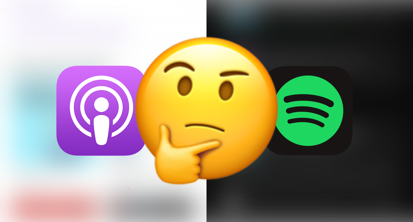
Pod save Spotify
 Duration
Early December 2019 (2 weeks)
 Tools
Tools
Sketch, Invision, Origami
 What I Did
User Research, Product Design, Prototyping, User Testing
Duration
Late Nov 2019 (1.5 weeks)
Tools
Sketch, Invision, Origami
What I did
User Research, Product Design, Prototyping, User Testing
*Quick note: To be clear, this is an unsolicited redesign. Also, I'm surprised and happy to see that in a recent update 2021 the Spotify app has implemented a search filter similar to my design proposal!
Introduction
Podcasts... a practical man's radio or lazy man's book.
Love them or hate them, the numbers suggest that they're here to stay. Personally, I love podcasts! I first started listening to podcasts 3 years ago when I found myself with large chunks of free time during my daily commute on the Caltrain and now I'm totally hooked.
Usually, I listen to my podcasts on the Apple podcast app; however, recently I tried switching to Spotify for my podcast listening after finding out that they had podcasts —also I wanted to make the most of my subscription!  — and that where I started to notice some problems...
*Internal struggle ensues
Overview
This UX case study focuses on improving the Spotify podcast UX for premium subscribers via design explorations and concepts. The designs respect existing Spotify design patterns and styling when possible, but are also informed by the findings from my own research and usability testing.
My high-level redesign goals were to
- Make it fast and easy for listeners to distinguish and locate podcast content
- Promote more content adoption, discoverability, and user engagement
- Optimize for and give users more control over common/standard podcast listening habits
Understand
Contrary to my design intuition and app audit, I still needed to do my due diligence by doing generalized research on the proposed problem space to 1) identify and address real user pain points and 2) learn about common podcast listening habits, and 3) organize my findings into scoped areas of focus.
My qualitative research informs the framing and the mental models of the identified users and problems, so that I can narrow my hypotheses for later quantitative research (surveys, lit reviews, and secondary research).
Organized areas of focus for redesign
- Creator and content discovery
- Podcast & podcast episode social proof
- Content adoption and engagement
- Podcast notification controls
- Podcast Library
Early Insights From Short User Interviews
So the first step in my redesign process was to conduct a series of quick user interviews to discover and learn about real user pain points and any possible workaround they employ.
I interviewed a total of 6 people—a mixture of friends and helpful strangers that I found on Reddit & Facebook— who were regular podcast listeners (which I initially broadly defined as users who listen to an average 7 shows a week based off of research from ) and had previously used Spotify at least once to listen to a podcast. Some of the major pain points that the interviewees identified were:
Some main identified pain points:
- Difficult to visually distinguish music and podcast content at a glance
- Lack of podcast credibility indicators (ratings, reviews, # of listeners)
- Confusion over podcast notifications
- Cluttered and confusing overall experience (no good visual and feature distinction between podcasts, songs, albums, artists, etc.)
- Lack of filters or sortings on podcast episodes (examples: no sort by popularity or filter by played)
- Difficult to find new podcasts and content
Survey
To gather more quantitative information on my interviewees' paint points and general podcast listener habits, I conducted a google forms survey targeting people who listened to at least one podcast regardless of platform. 16 people responded.
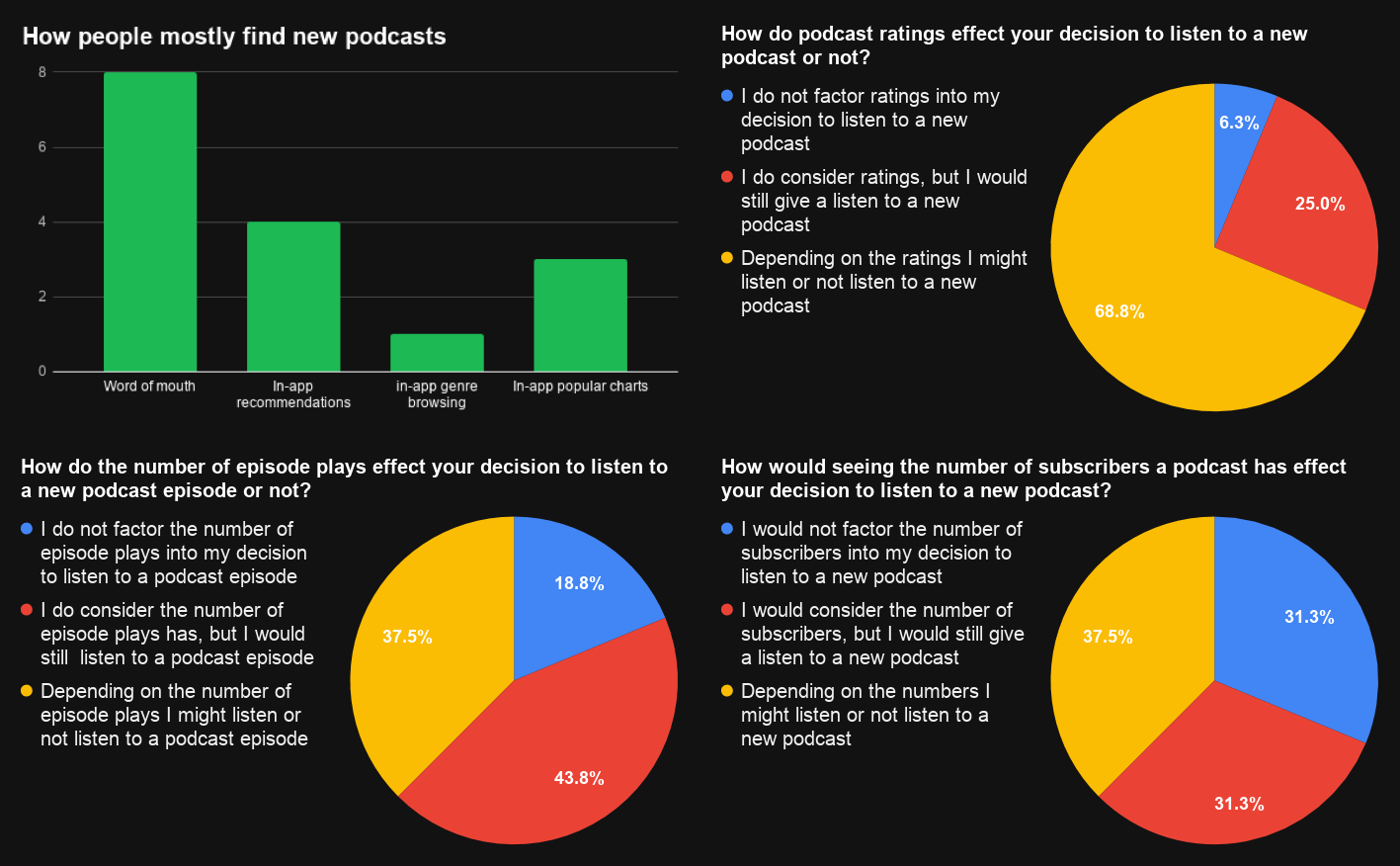
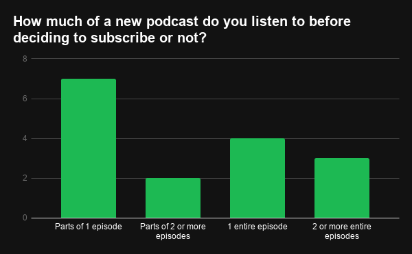
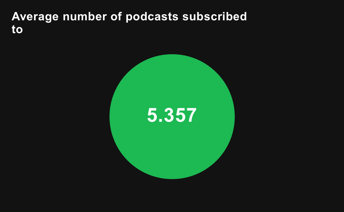
Some of my survey findings
Observations + Empathy Map + Affinity Diagram
To gain a more intimate understanding and of how users behaved specifically in the Spotify space, I selected 4 people with differing levels of familiarity with podcasts and Spotify's app to observe them trying to find/navigate to a given podcast and let them explore the app from there. (I also instructed them to think out loud)
I took screen and audio recordings while also taking notes for to later populate my empathy map (see below). I then took all my findings and sorted them into an affinity diagram to organize areas that I should focus on:
- Podcast & podcast episode discovery
- Podcast notifications
- Podcast & podcast episode social proof
- Podcast & podcast episode engagement
- Watch later/playlists

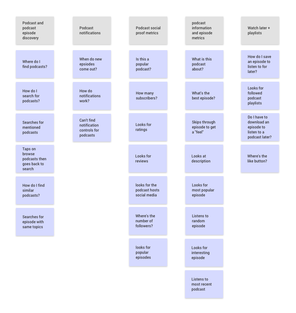
Empathy map and affinity diagram
Secondary Research + Competitive Analysis
I took a look at available Spotify podcast listener behavior + general podcast listener data (like how .001% of listeners download podcast episodes) and academic research on social proof, notifications, and media consumption decision processes (like how Netflix and Youtube users spend on average 90 seconds on deciding whether or not to continue watching their selected media).
Based on my research, I took a look at popular podcasting apps (Apple Podcasts, Overcast, Castro, and Sticher) to see if and how they handled my identified Spotify podcast experience problem areas. In general, they all worked really well, especially when it came to notification controls and social proof (ratings, reviews, recommendations, etc.); however, this is mainly due to the fact that these are all podcast specific apps. Spotify having music and podcasts was a very unique dilemma that required personalized solutions.
Ideation
Referencing my findings, I created personas, design principles, user flows, wireframes, and low-fidelity interactive prototypes.
Personas
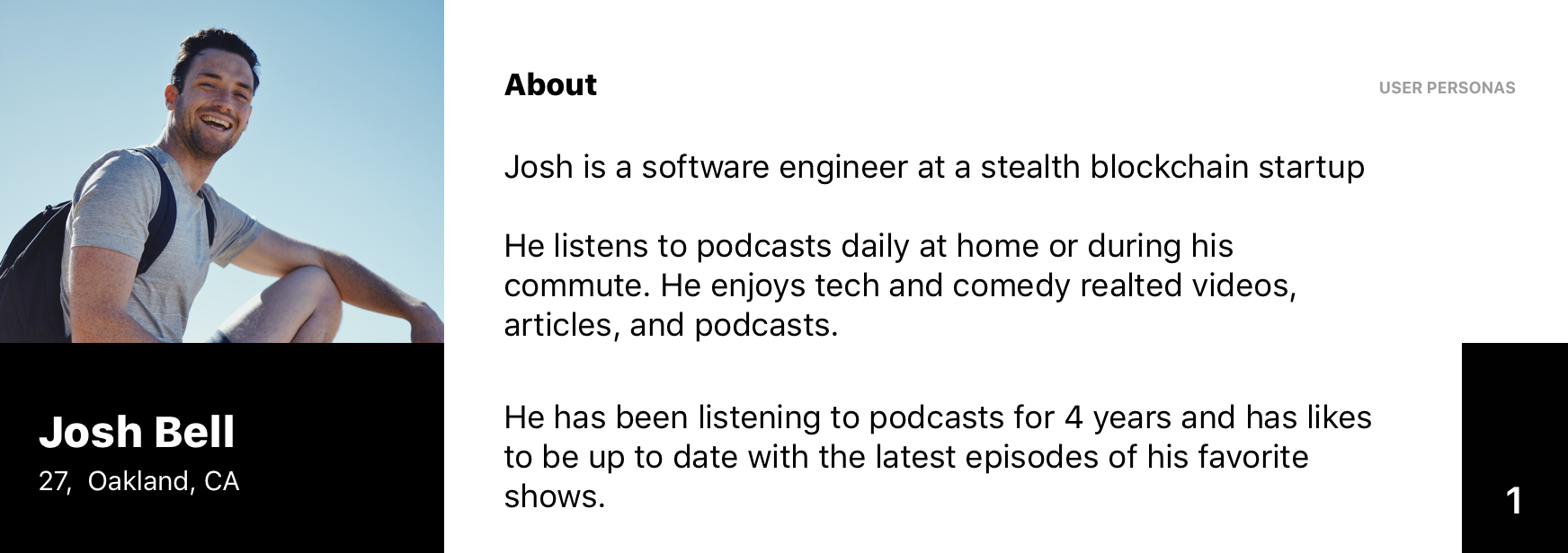
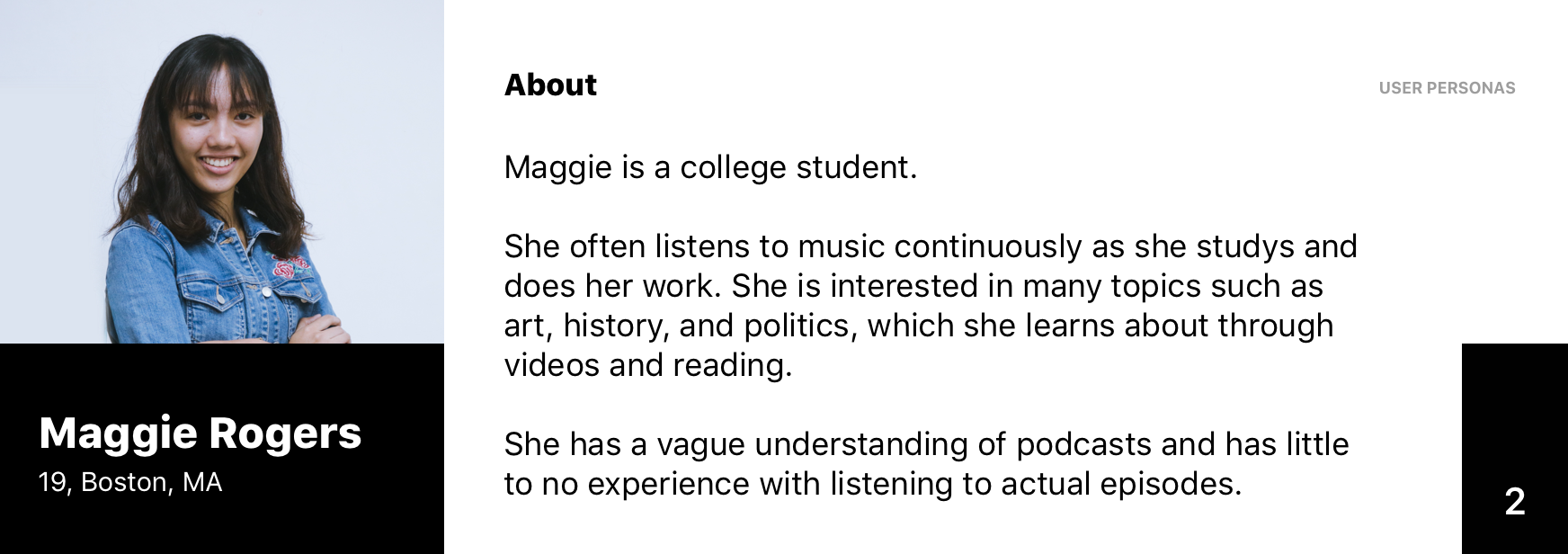
My personas that I think reflected my target users
Design Goals
- Improve user experience by removing frustrations in common user flows.
- Help users find/identify what they are looking for and help them discover new interests.
- Help users engage more with the content and have a better social experience.
Information Architecture
Some alternate wireframes
Some current task flow and wireframe iterations
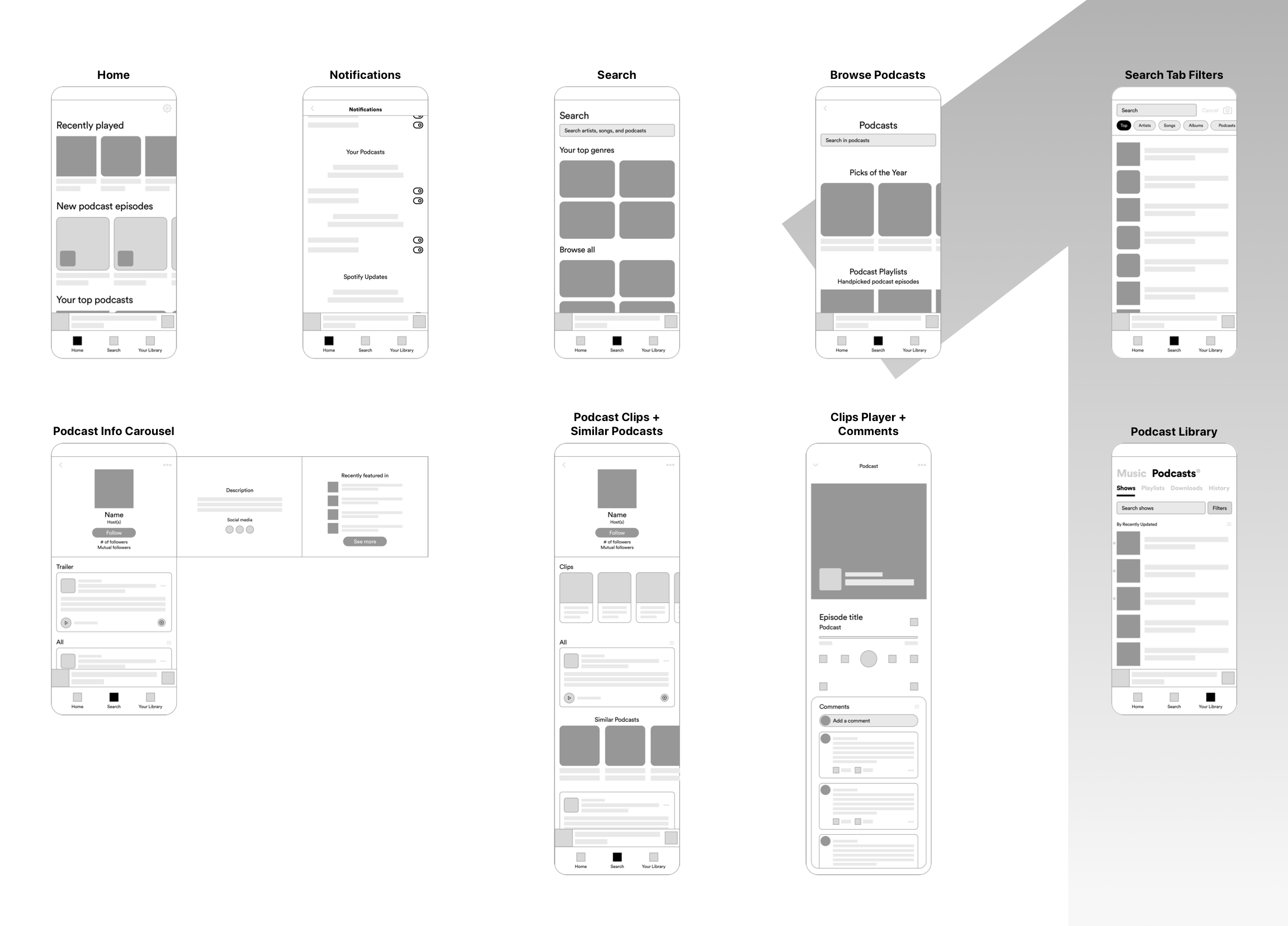
Current Design Iterations
Below are my current design iterations, but in order to fully validate them, I would have to do further usability testing with a much larger sample size and compare the new designs’ performances with baseline key Spotify metrics. I have only been able to do task completion and timing tests but given access, resources, and time I would use a variety of testing methods like A/B testing, multivariate testing, and eye tracking/heat mapping.
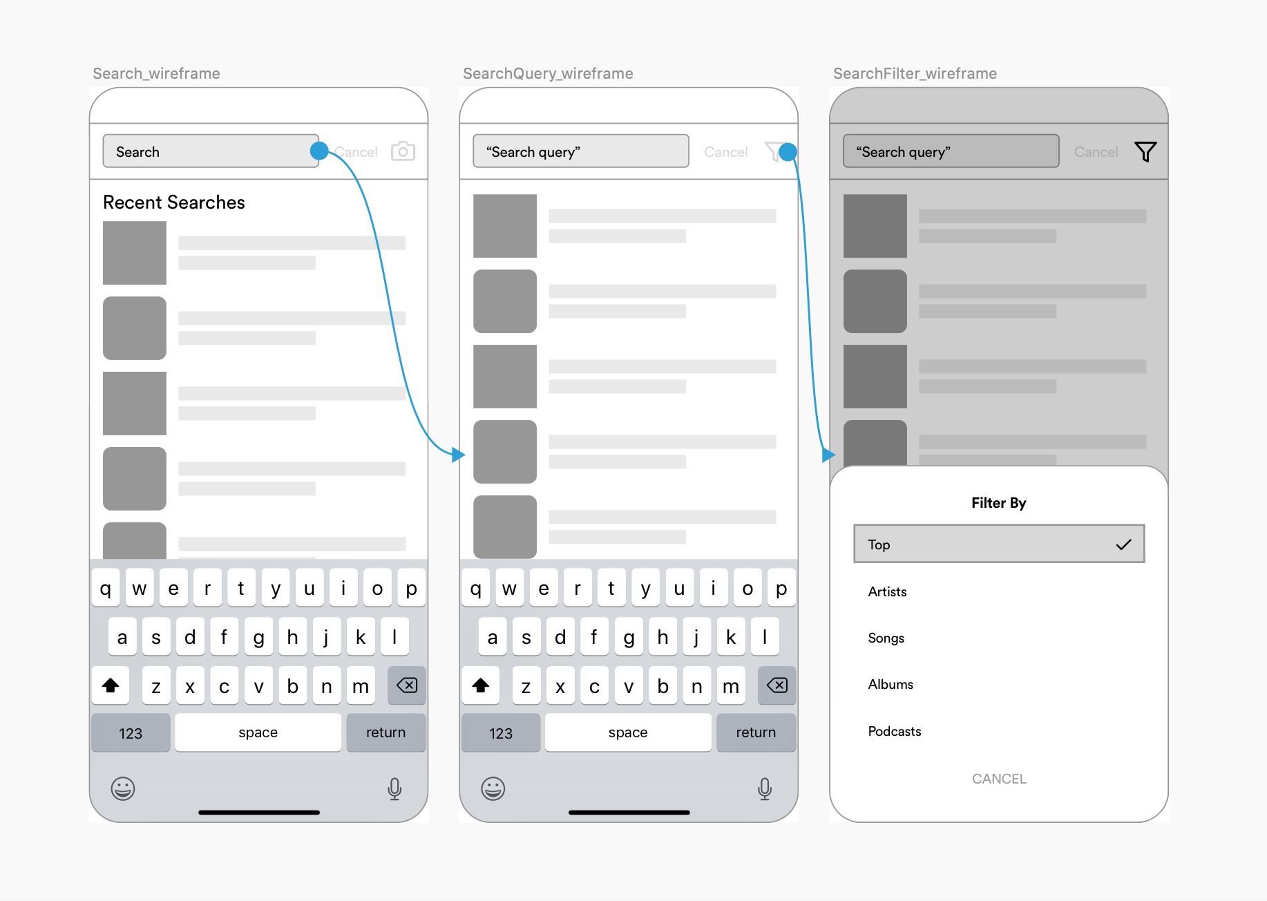
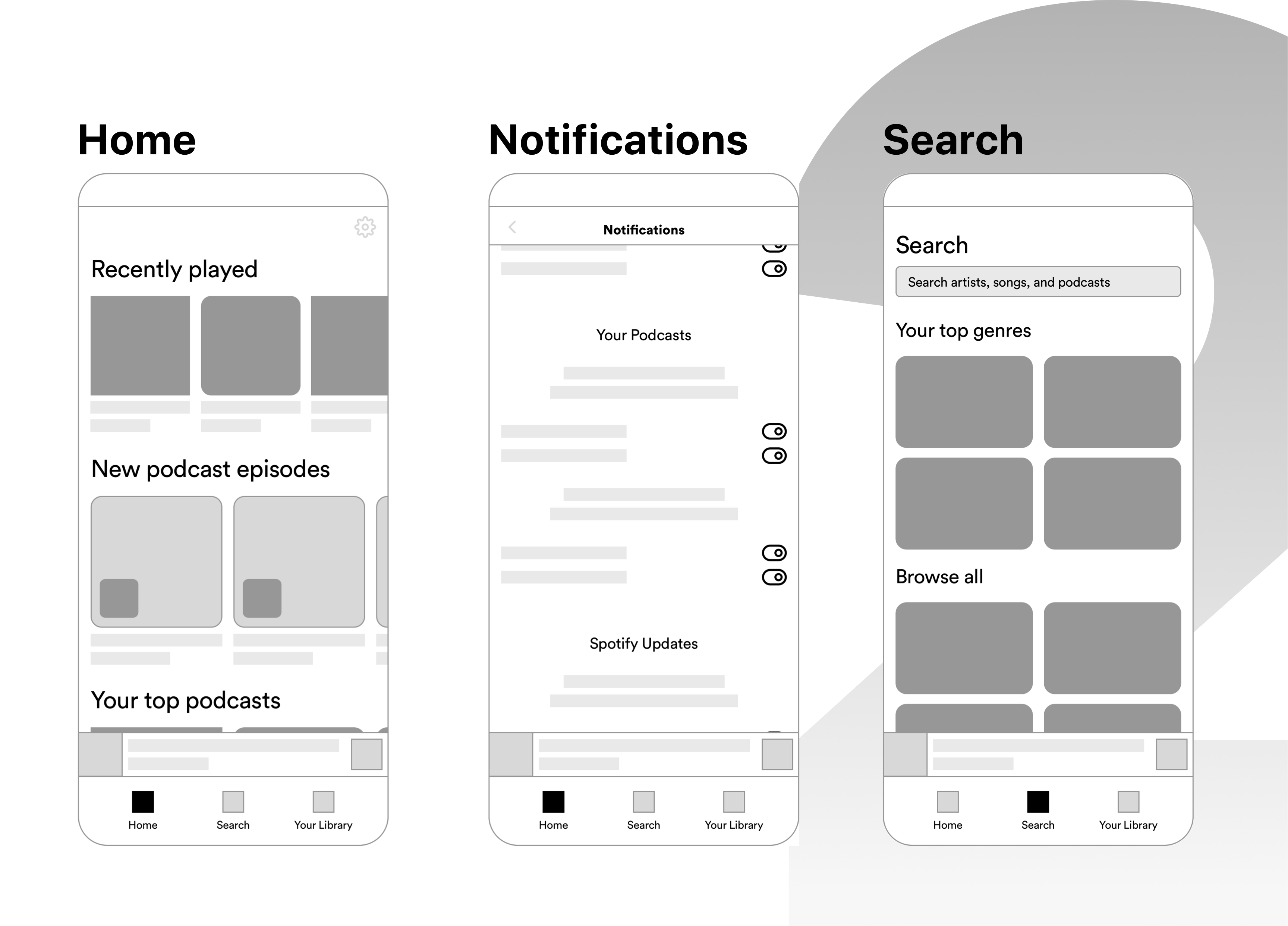
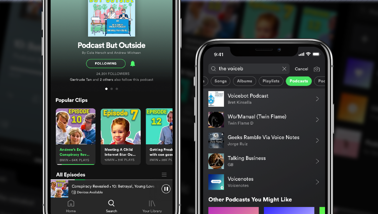
Search Prototype
Existing: Search flow + hidden category filters (early December 2019)
Existing: Search flow + hidden category filters (early December 2019)
Proposed: Filter chip bar below search field
Proposed: More search results real estate + efficent search flow
Implemented by Spotify in 2021 update!
Proposed: More search results real estate + efficent search flow
Key changes and rationale:
- I substituted the existing search category filtering section that was hidden by the keyboard with a tab category filtering bar, which freed up real estate for more search results (allowing users to browse— via continuous scrolling— and find their search items quicker), boosted filter feature awareness/use (the filters' visibility is no longer initially hidden by the keyboard and improved the overall search flow.
- I conducted usability tests with 5 participants, where I tasked them to find a specific podcast after telling them the name of the show and hosts. I kept track of the time and whether or not they were able to complete the task. The proposed design's time based efficiency was .38 goals/sec compared to .28 goals/sec for the existing design. Overall relative efficiency of the proposed design increased by 36%.
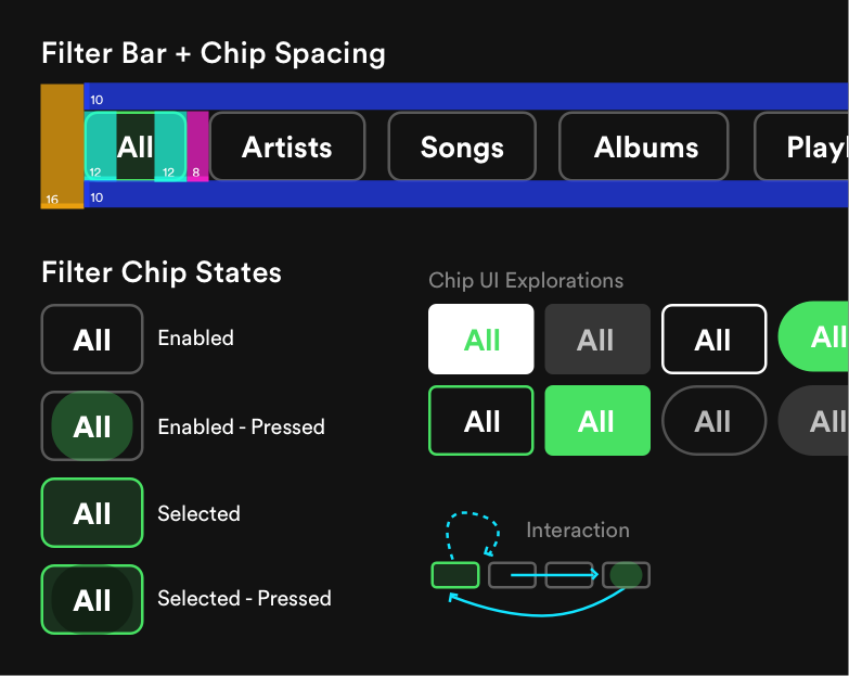
Filter bar and filter chip spacing, filter chip states, and UI exploration. The “All filter” is selected by default first, and when an enabled filter is pressed said filter moves all the way to the left replacing the previous selected state filter which returns to its original position in the enabled state.
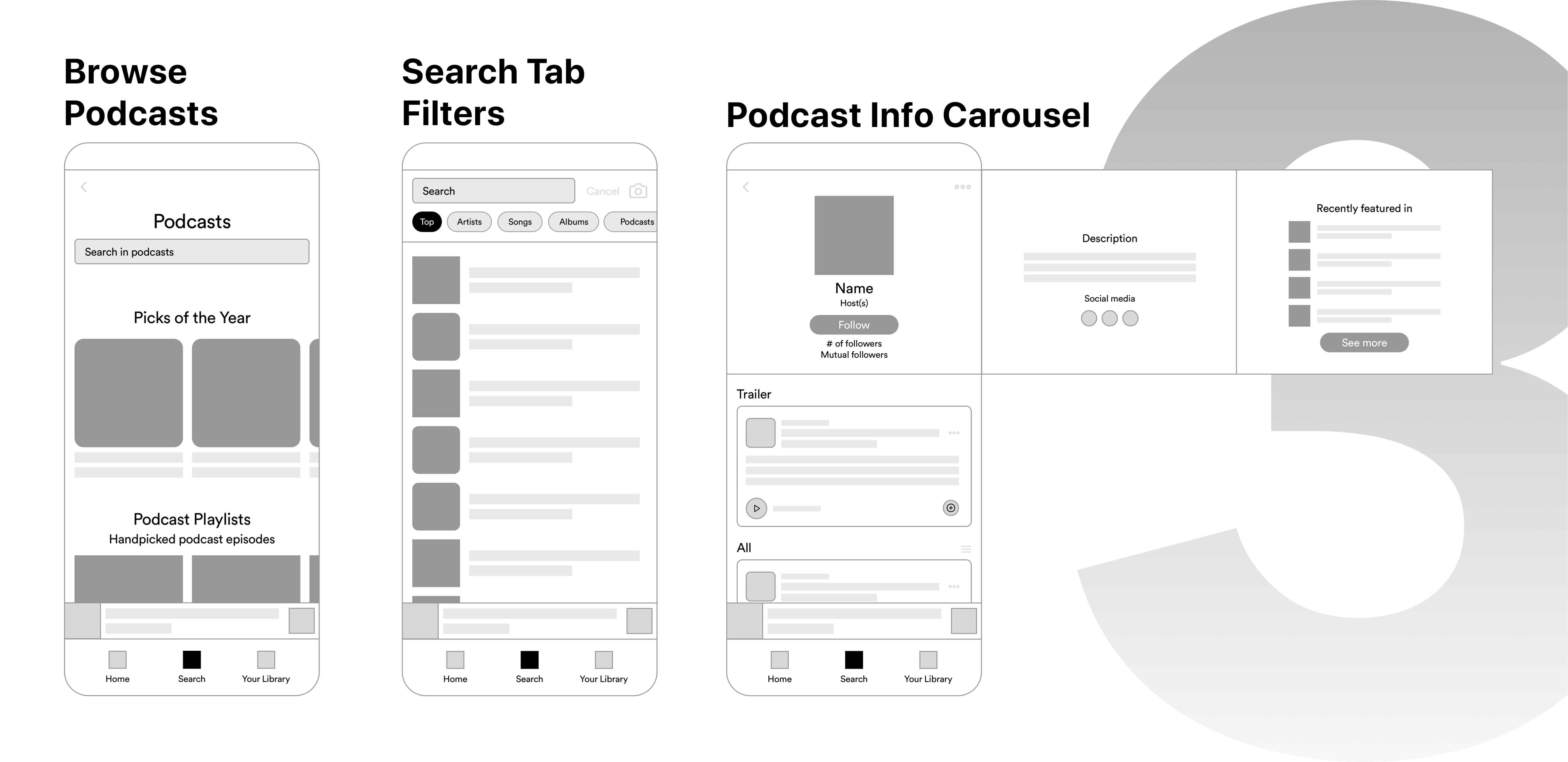
Podcast Browse Flow Designs

Existing: Podcast browse all page (early December 2019)
Proposed: Podcast specific search field + rounded podcast covers
Key changes and rationale:
- I added a podcast search field, which gives users the ability to quickly search through podcasts without going back to the original search screen (saving users' an extra 3 interactions) or to just search in general. This accounts for the case where users might tap on browse podcasts without really thinking about what action they wanted to accomplish (accounting that users don't always make optimal decisions). Users still have the option to go back to the main search screen.
- I rounded off the corners to the podcast thumbnails to adhere to my proposed podcast asset design branding for podcast design consistency (see some examples below).
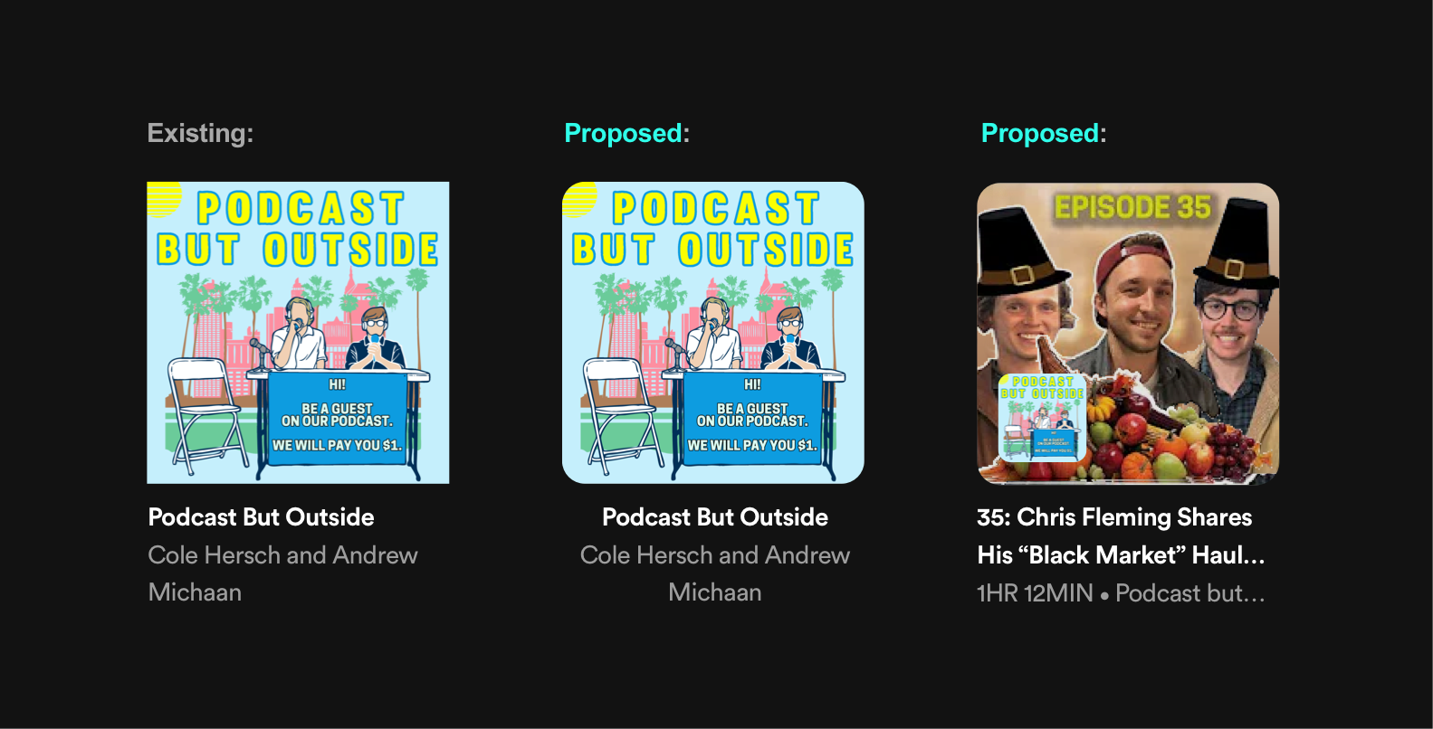
The existing podcast cover design (left) is the same as music covers, by rounding corners users can identify visual distinctions between podcast and music content. Also cover designs for podcast episodes, that I propose should show up in the browse or home pages, use both the podcast's profile and episode thumbnail images.
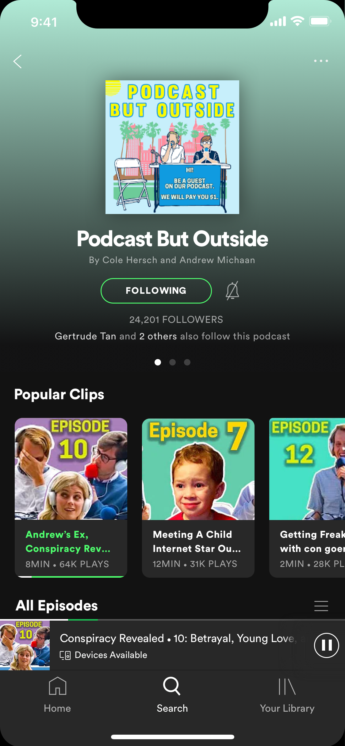
Podcast Information Carousel + Trailer Designs
Existing: Podcast page with info carousel (early December 2019)
Proposed: Podcast follower numbers + mutal followers + notification bell + social media links + podcast appearances + podcast trailer episode
Key changes and rationale:
- I added podcast followers count, mutual followers, and episode play count, which provide social proof/power of the tribe. Having these numbers can ease users of decisions (like following a podcast or playing an episode) and assure them that they are not alone.
- I also added social media links so that listeners can easily follow the podcast on other social media platforms. Today our media and social media are closely related/interconnected, which allows users to be much more engaged with the content and its creators. Studies show that cross-platform content consumption creates stronger audience engagement and investment.
- I added a notification bell that appears after you follow a podcast, this gives users more minute control over notifications.
- I added a trailer episode for first-time visitors so that they can get a good curated sample of the podcast's content without blindly investing time. I also want to explore substituting trailer for recommended, which would allow podcast hosts control over content entry points. On average users spend 40-60 seconds to determine whether or not they will watch, which I extrapolate to listen, to a piece of content. Since podcasts formated for long listening, some users' may be turned off by slow-acting content. So I hypothesize that immediate introduction to tested and targeted segments in shorter formats may boost listener retention. This al
The existing podcast episode card design (left) uses the podcast profile image for ALL the thumbnails. I propose that the episode thumbnails be customizable, to provide podcast hosts with the ability to communicate more visual information about the episode. I removed the redundant podcast title with the episode release date and added in episode plays. Also the download button is first an add to watch later playlist that turns to a download button see below.
Episode Filters + Similar Podcasts Designs
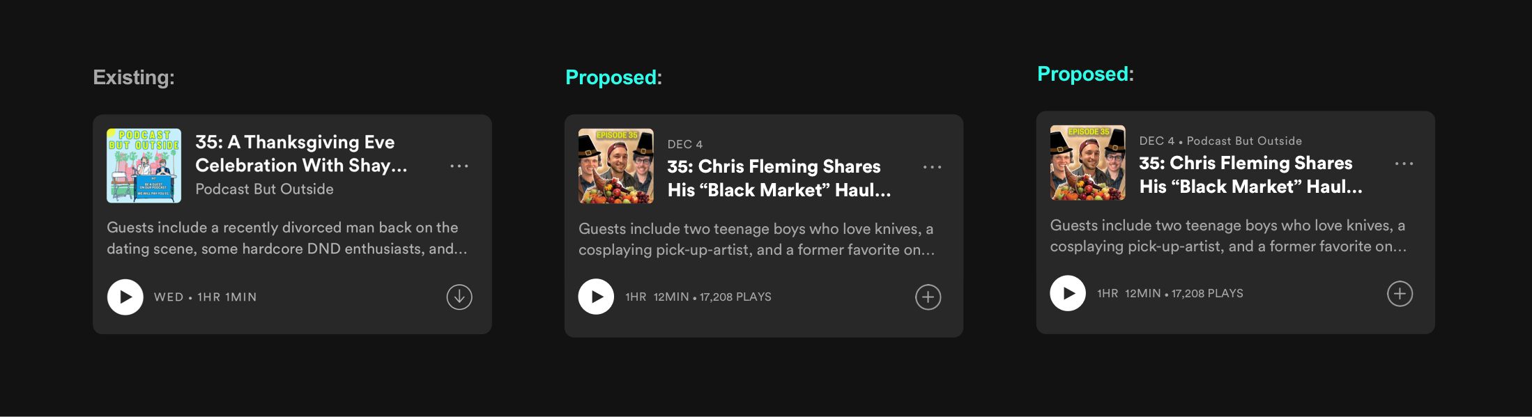
Existing: Podcast page with episode filters (early December 2019)
Proposed: Downloads filter with number of downloads, watch later filter, most popular filter, similar podcasts, and watch later/download flow
Key changes and rationale:
- I added the number of downloaded episodes in the downloads filter so that users can quickly see how many downloads they have.
- I also added a watch later filter so that listeners can easily access episodes they saved to watch later.
- I added a most popular filter sort that lets users sort podcast episodes by most plays + likes (not that exact algorithm, but something like that)
- I added a default watch later button that turns into a download button for a better flow that doesn't waste extra card space for downloads (since Spotify users tend to stream podcasts, only .001% of users download episodes)
Podcast Specific Episode Search Designs
Existing: Podcast home page (early December 2019)
Proposed: Pull down podcast specific episode search field reveal
Key changes and rationale:
- Added podcast specific episode search so that users could now easily look for certain episodes instead of browsing all episodes with continuous scroll. Searches can reference podcast episode titles or episode descriptions.
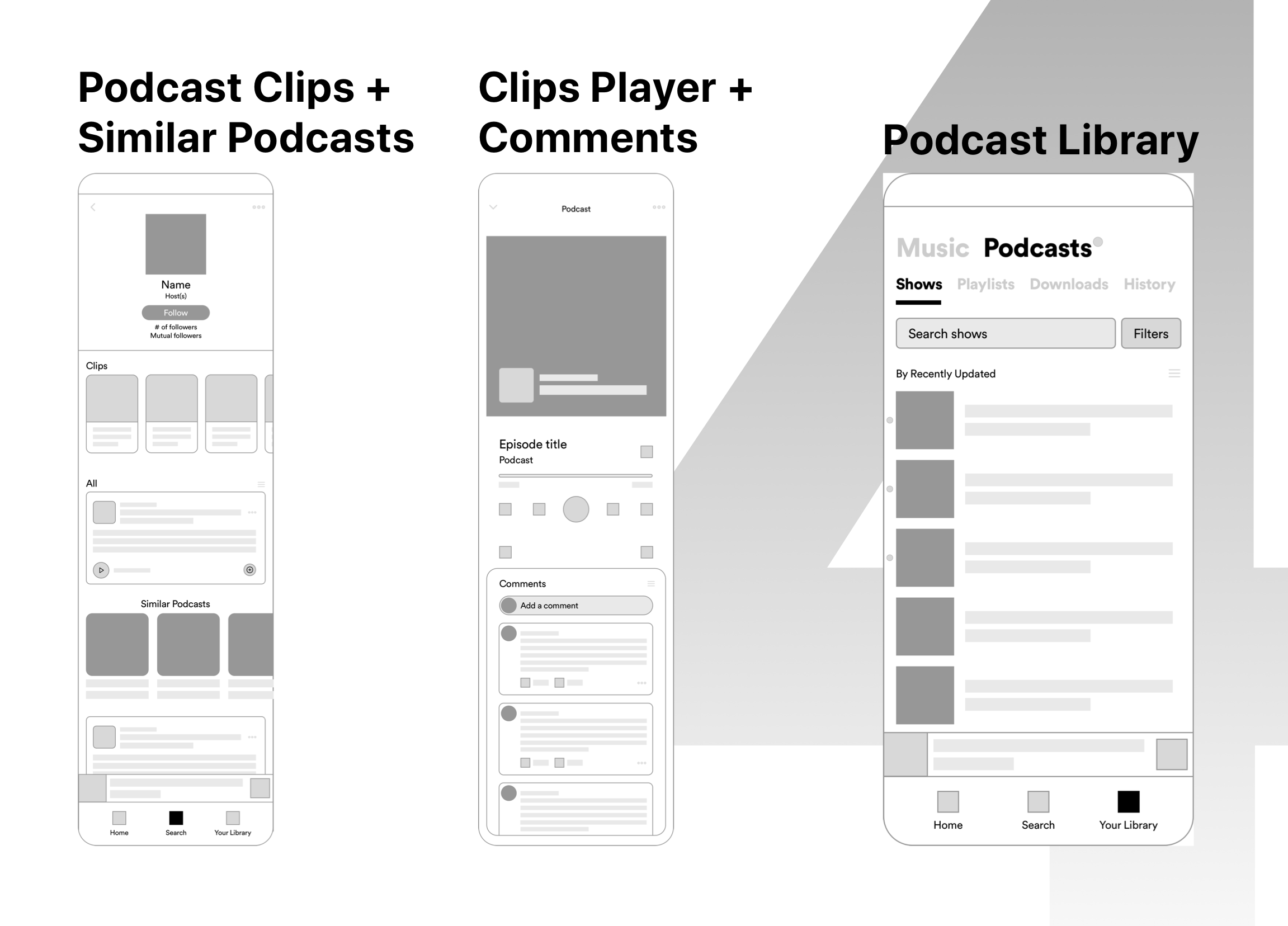
Clips + Comment + Media Player Designs
Proposed: Podcast clips and episode comments
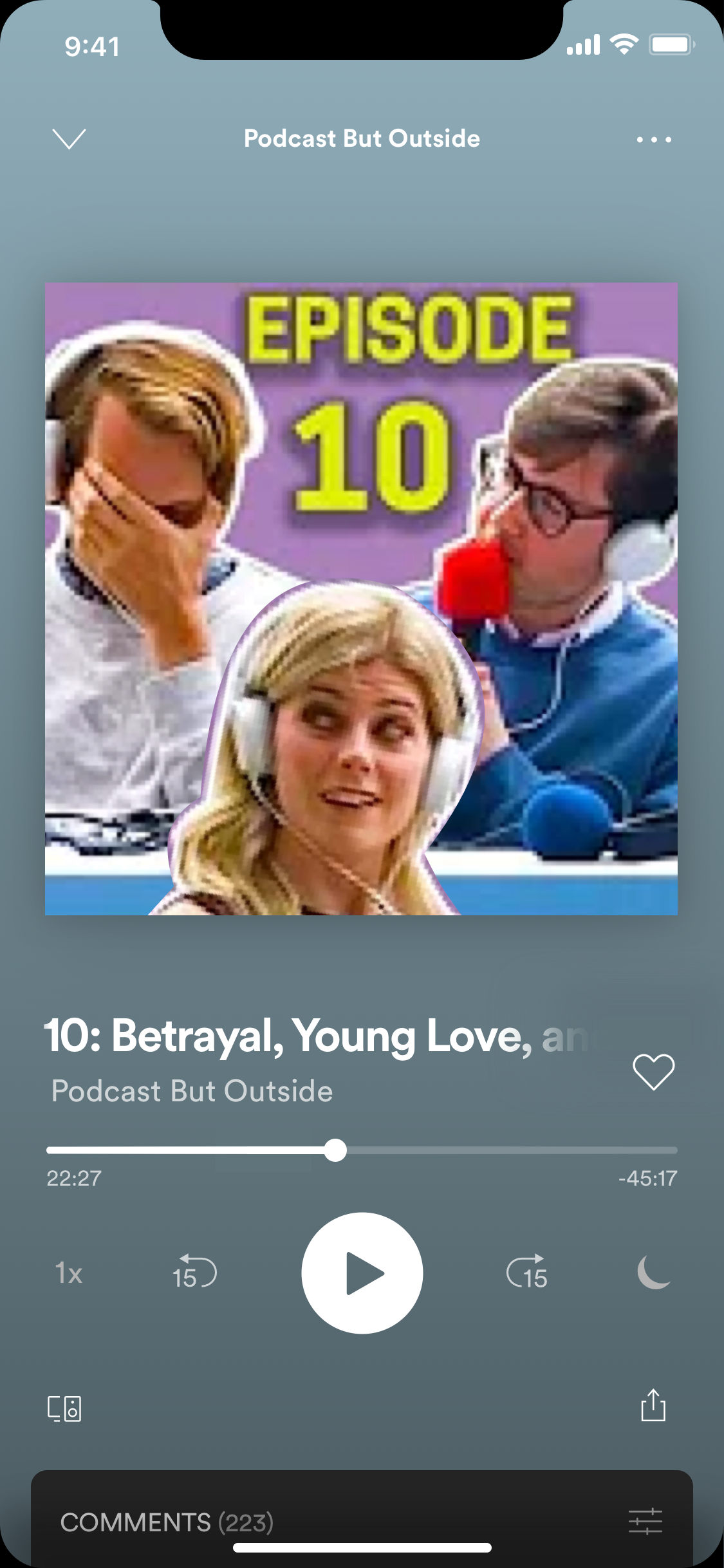
Proposed: Media player with episode thumbnail cover
Proposed: Media player with episode thumbnail cover
Proposed: Media player with episode thumbnail cover
Key changes and rationale:
- I wanted to try podcast episode highlights, in lieu of podcast trailers, that let users jump right into the good part of a podcast episode. This lowers the time-investment for users who are new to the podcast.
- I also let users like podcast episodes, this provides Spotify with an extra data point to use in their recommendation/personalization machine learning algorithms.
- Also, I added time-sensitive media since some podcasts (who also video record themselves) forget that they use as an audio medium so this also allows podcasters to show their listeners content like short video clips or images. Studies show that young people primarily Gen Z and Millenials favor visual content due to the manner in which they communicate, so providing not just audio content may prove to be attractive to younger users.
- I also added episode comments for community building. Users should also be able to place timestamps. Having a comment section allows podcasters to better understand the audience, while also providing more information for a possible episode recommendation algorithm. Its a win both for podcast listers and hosts!
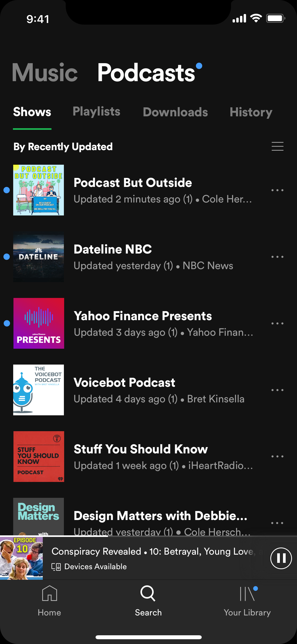
Podcast Library Designs
Existing: Podcast Library (early December)
Proposed: Shows filter (with updates/notifications), podcast playlist tab (watch later, liked podcast episodes, and followed podcast playlists), and history tab
Proposed: Updates/notifications control flow
Key changes and rationale:
- I made changes to the existing tab order, placing the shows tab first. This allowed users to quickly access their followed podcasts as well as being able to those podcasts ordered by recent updates on default.
- I also added a playlists tab because currently, any podcast playlists that you follow show up under the music playlist's tab. This is also where users can find 2 pre-made playlists: liked and watch later episodes playlists.
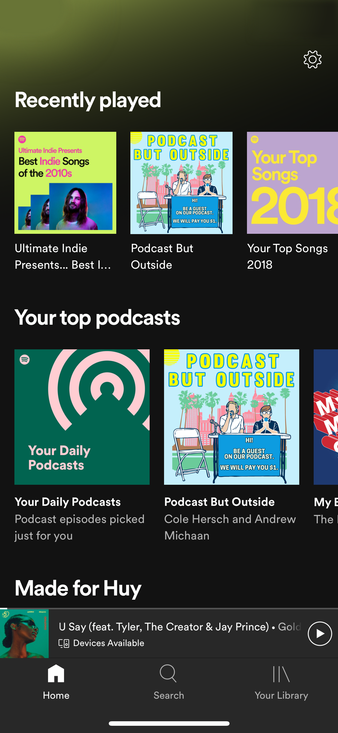
- Finally, I changed the episodes tab to a history tab since that naming makes more sense with its function. I didn't see it as redundant in regards to the home page's recently played section (seen below) since users are likely to listen to songs in between.
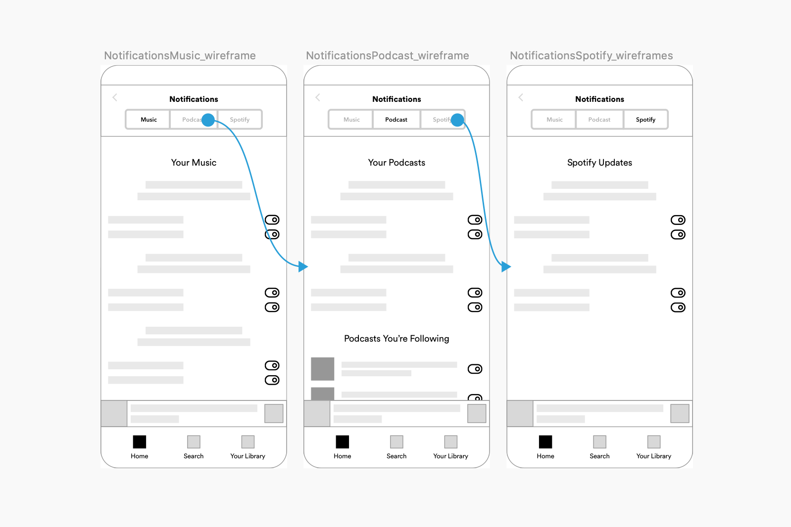
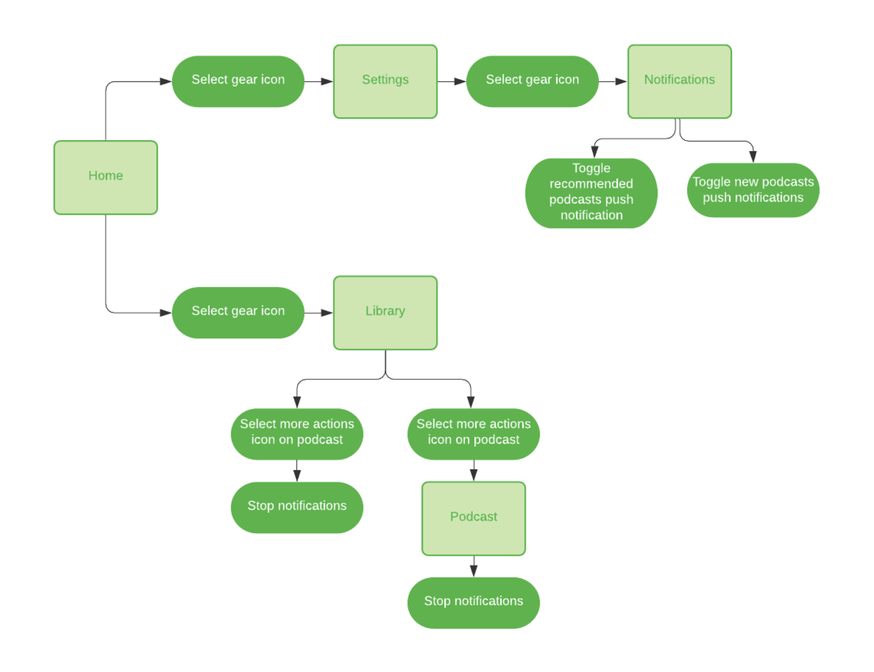
Notification Control Designs
Existing: Podcast home page (early December 2019)
Existing: Notification center (early December 2019)
Existing: Notification center (early December 2019)
Proposed: Podcast notification controls + slight design change
Key changes and rationale:
- I added in podcast notification controls, which allows users to take control of how they receive their podcast notifications. I also wanted to employ a notification technique that sends an alert about automatically muting notifications after a few days of inactivity to stop bombarding users with notifications and guilt them into checking out the updates.
- I also added icons next to the main notification sections (music, podcasts, and Spotify) for easy recognition. I contemplated making everything left justified but opted to stick with old center justified design.
Conclusion and next steps
I really enjoyed doing this redesign, it was something that I was particularly invested in as a frequent podcast listener. I am definitely more comfortable with prototyping micro-interaction using Origami and have a deeper understanding of Spotify's UI design.
The next step would be to run more extensive usability testing, especially to see if the altered podcast library is effective. I also would like to compare the podcast following rates between episode trailers and episode clips features, but that might be out of my current capabilities.
I will also state that the amount of research I did pales in comparison to that of Spotify's Research and Design Teams, so I definitely do not claim that my redesign is better than the current version of the app. I think that more research, usability studies, and design changes will improve the Spotify podcast experience, after all design is an iterative process!
*Recent updates to Spotify have included rounded corners to most podcast covers/thumbnails on the app, so I'm glad they're fixing that!
My Projects
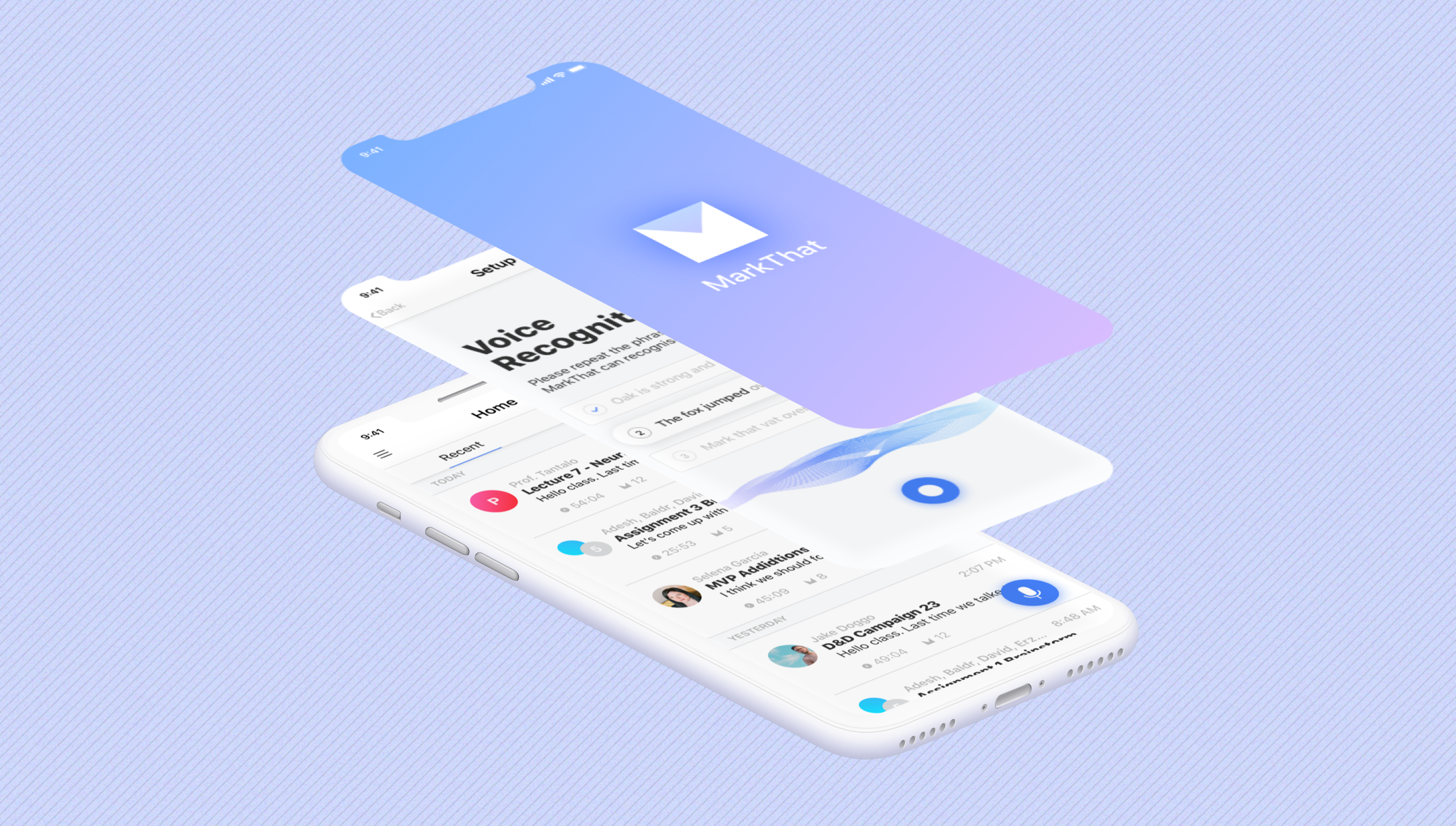
MarkThat: Voice Powered NotesProduct Design, iXD, Prototyping
Spotify Podcast RedesignProduct Design, iXD, UI Design, Prototyping
Fiori Design System and more @SAPProduct Design, iXD, UI Design, Prototyping
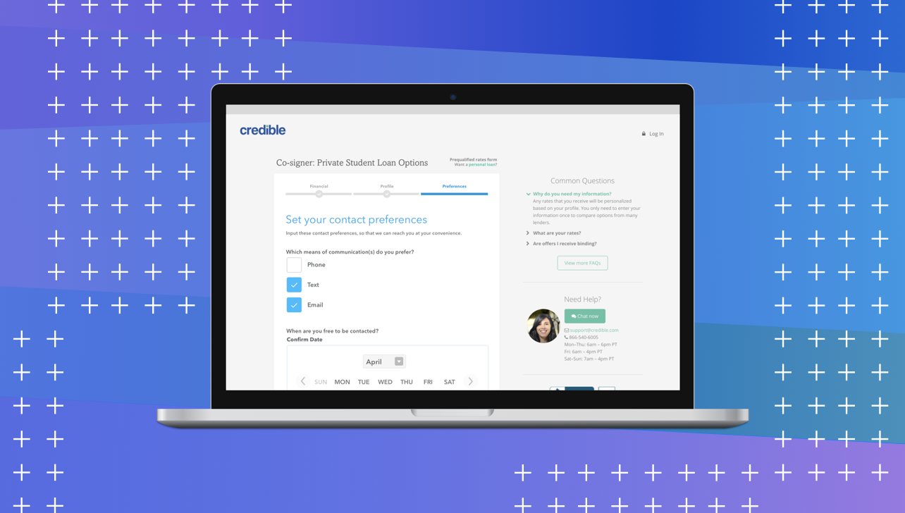
Credible — Contact PreferencesProduct Design, iXD, User Research
UCSC HCI Lab — EmotiCalResearch, UX/UI Design, Development

Voice @Yahoo!VUI Design, UX Research, Prototyping