
SAP's
Fiori Design System + more
Redesigning Spotify's Podcast Experience
Arches are apparently in right now? From left to right: Fiori for iOS 6.0 (2020) components & patterns, Fiori Horizon 8.0 (2022) theme update, and SAP Apps with new app icons + horizon adoption
 Duration
2019 - Present
 Tools
Tools
Sketch, Invision, Origami
 What I Did
UX/UI Design (iOS, Android, & Web), Research, Prototyping
Duration
Late Nov 2019 (1.5 weeks)
Tools
Sketch & Abstract -> Figma, Framer, Origami
What I did
User Research, Product Design, Prototyping, User Testing
Introduction & Context
A fundamental struggle that plagues large and mature companies like SAP is the design disjunction of its offerings that naturally comes about as teams who have been historically working in their own silos create their own redundant and/or conflicting UI, logic, and UX patterns with little regard for holistic consensus and guidance.
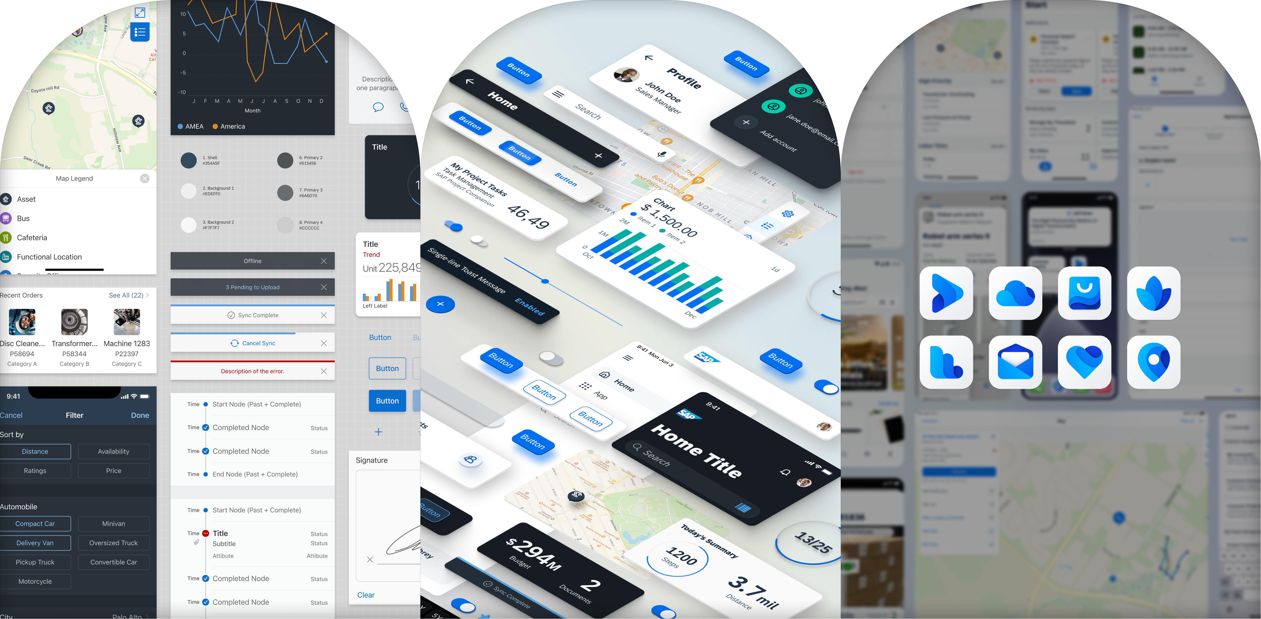
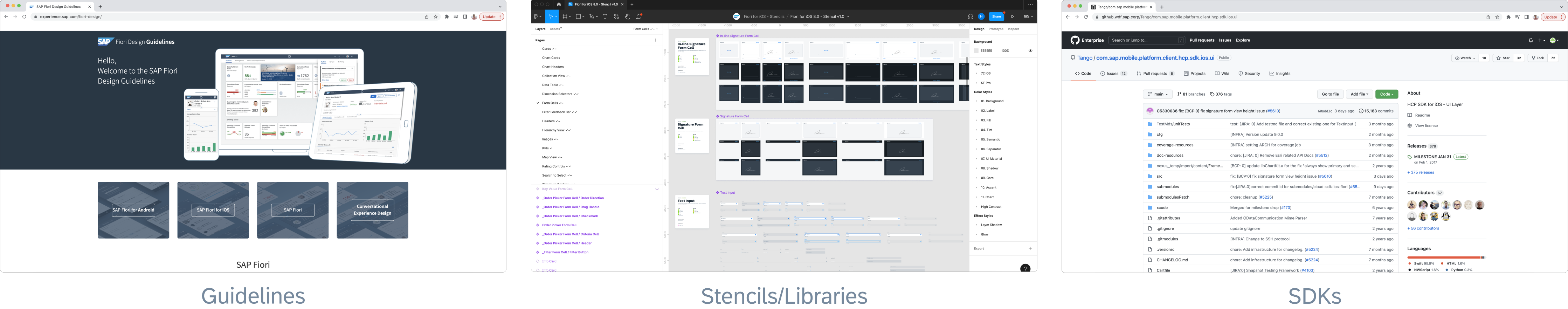
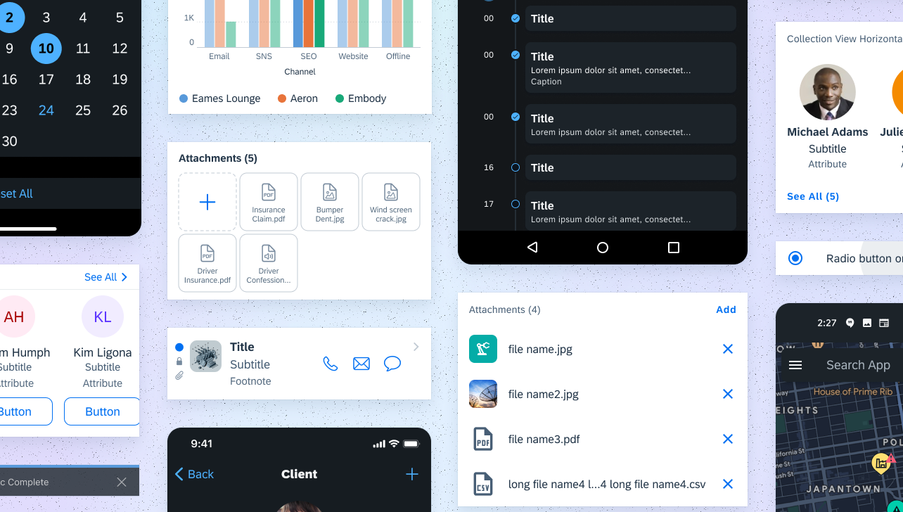
Enter Fiori, the cross-platform design language and system for SAP and their customers' digital products and services. Fiori's goal is to unify and ensure the design quality of the entire SAP organization through guidelines, consultations, design stencils, and Software Development Kits (SDKs) on our principles, interaction models, patterns, and components.
As a designer on the mobile team, I mainly work on Fiori for iOS while sometimes supporting the Android side to create a cohesive and robust design system for developers and designers to build their own native apps.
My other responsibilities include, but are not limited to:
- Designing and enhancing new and existing components and patterns
- Running studies with the SAP User Research (UR) team as the designated UR advocate on the mobile team
- Leading iOS theming and visual design (Fiori Horizon refresh)
- Maintaining and updating Figma design libraries/stencils (championed and completed massive migration from Sketch/Abstract to Figma)
- Writing guideline articles and creating other enablement materials
- Reviewing other app team design releases & design consultations
- Working on Mentor App (our ios and android interactive playground applications for mobile designers and developers explore the flexibility of Fiori's components and patterns)
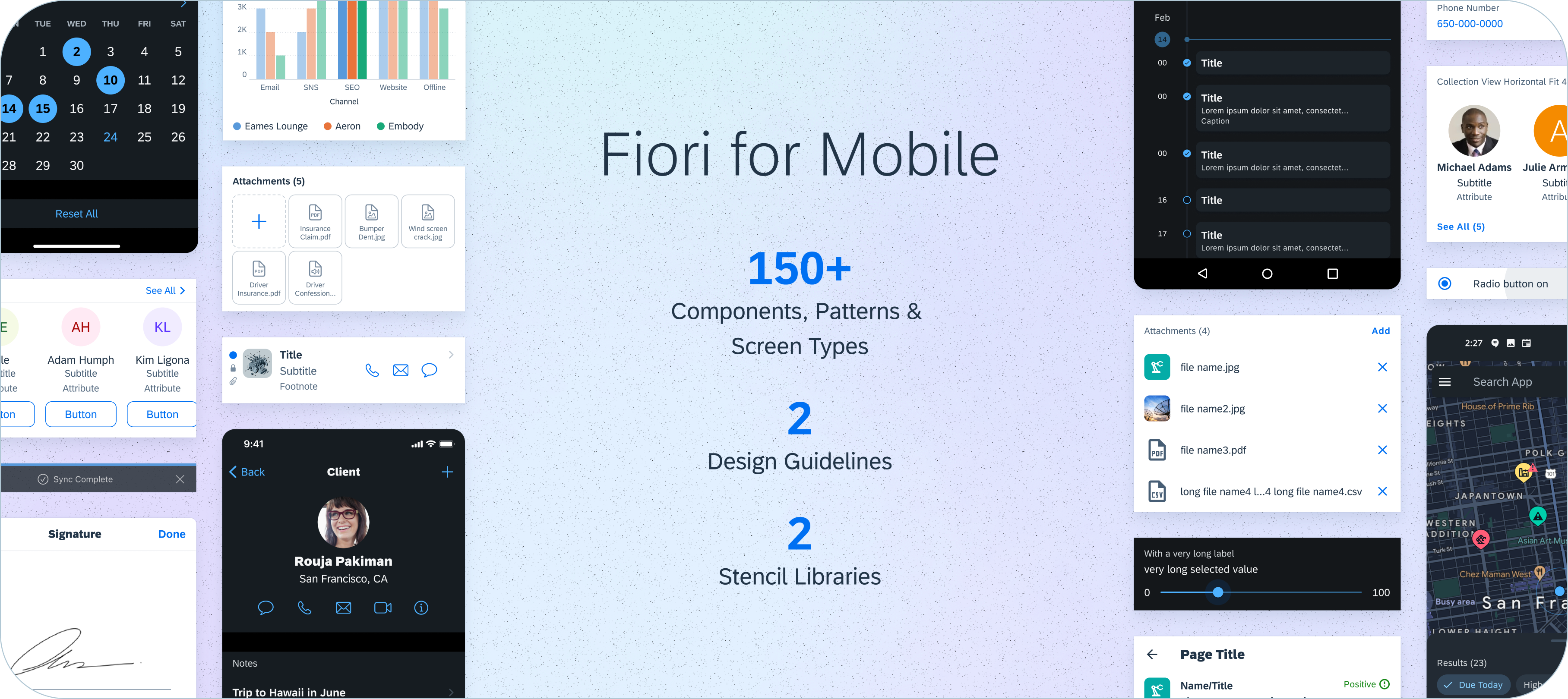
An overview of what Fiori Mobile covers using new visual design Horizon theme 7.0 update (Jan 2022)
Also with my manager's blessing, I have been able to split some of my team to work in the SAP Conversational UX and CAI/Fiori for Web teams.
For the CUX team, I started working on establishing new libraries/stencils for both iOS and Web— leveraging my experience with the Fiori for Mobile team—and now mainly work on enablement materials & component design requests. As for the CAI team, I work on Explainable AI with developers and researchers on progressive handling scenarios.
This is a demo I made in collaboration with product managers from S/4HANA about a potential MS Teams integration for SAP leadership to use in their partnership talks with Microsoft
Worked on XAI concepts with the AI teams, designed and developed dialog models & tailored components
My Topic Gallery
Found below are some components and patterns that I have worked on solo or with other designer partners (meaning designing, speccing, and stenciling), the links go to guideline articles that I've written. For a more detailed look into my design process, you can check out my work on the slider enhancement process.
Sidebar (iOS)
Updated the existing sidebar pattern to the new Fiori Horizon visual theme and current iOS 15 release.
*Additional Credits
Sang P.
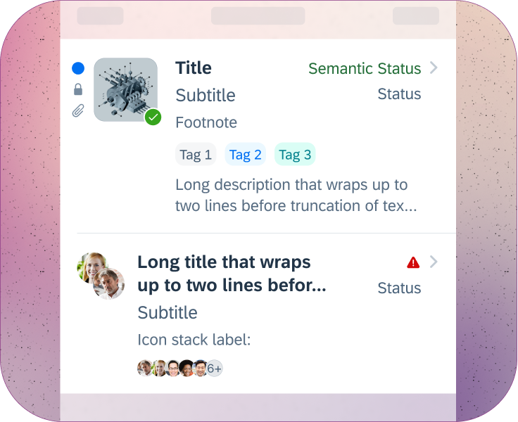
Object Cell (iOS)
Updated our object cell layouts and elements to be more flexible and handle additional use-cases.
*Additional Credits
Evan S.
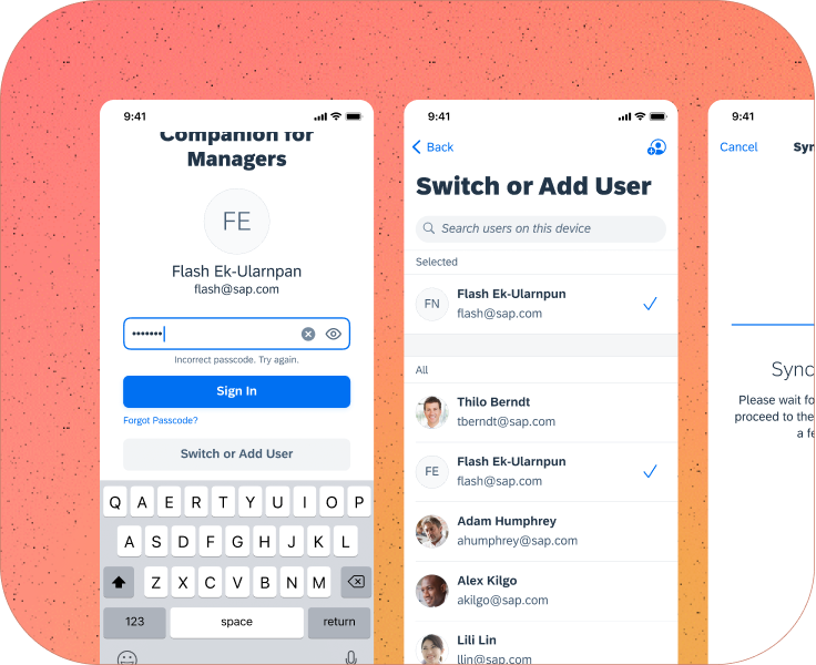
Multi-user Onboarding (iOS+Android)
Lead the design of the new multi-user onboarding pattern along w/ single-user onboarding flows.
*Additional Credits
Mianying C.
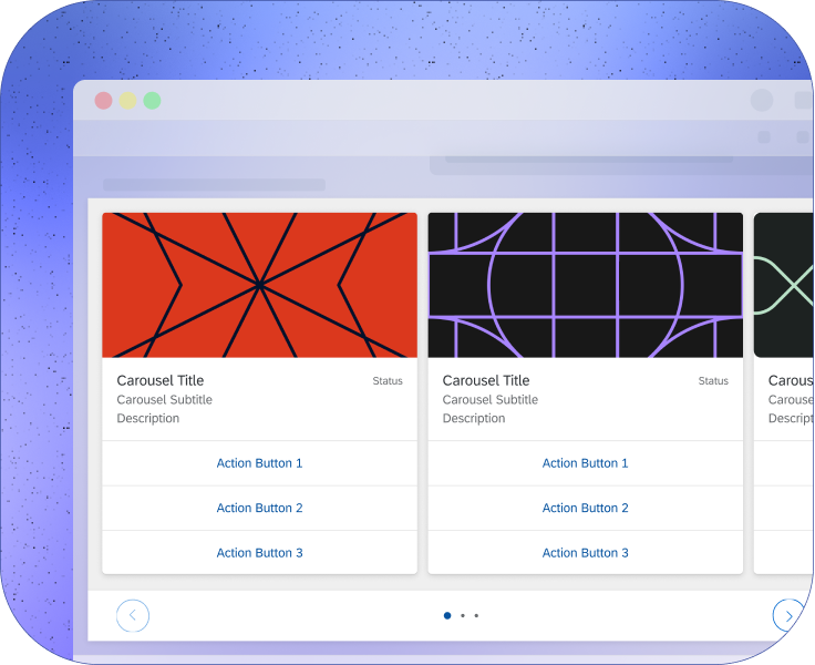
Carousel (CUX)
A horizontal list of object cards that provide users with a better comparison format.
*Additional Credits
Wei G.
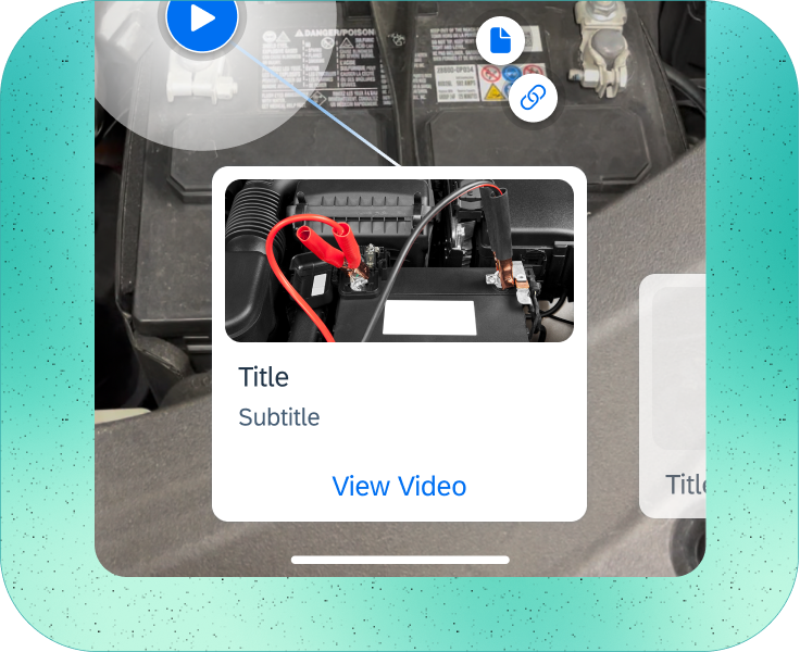
AR Annotations (iOS+Android)
Designed & prototyped AR scanning pattern and card components behavior, motion, and animations.
*Additional Credits
Vrusha C. & Mina M.
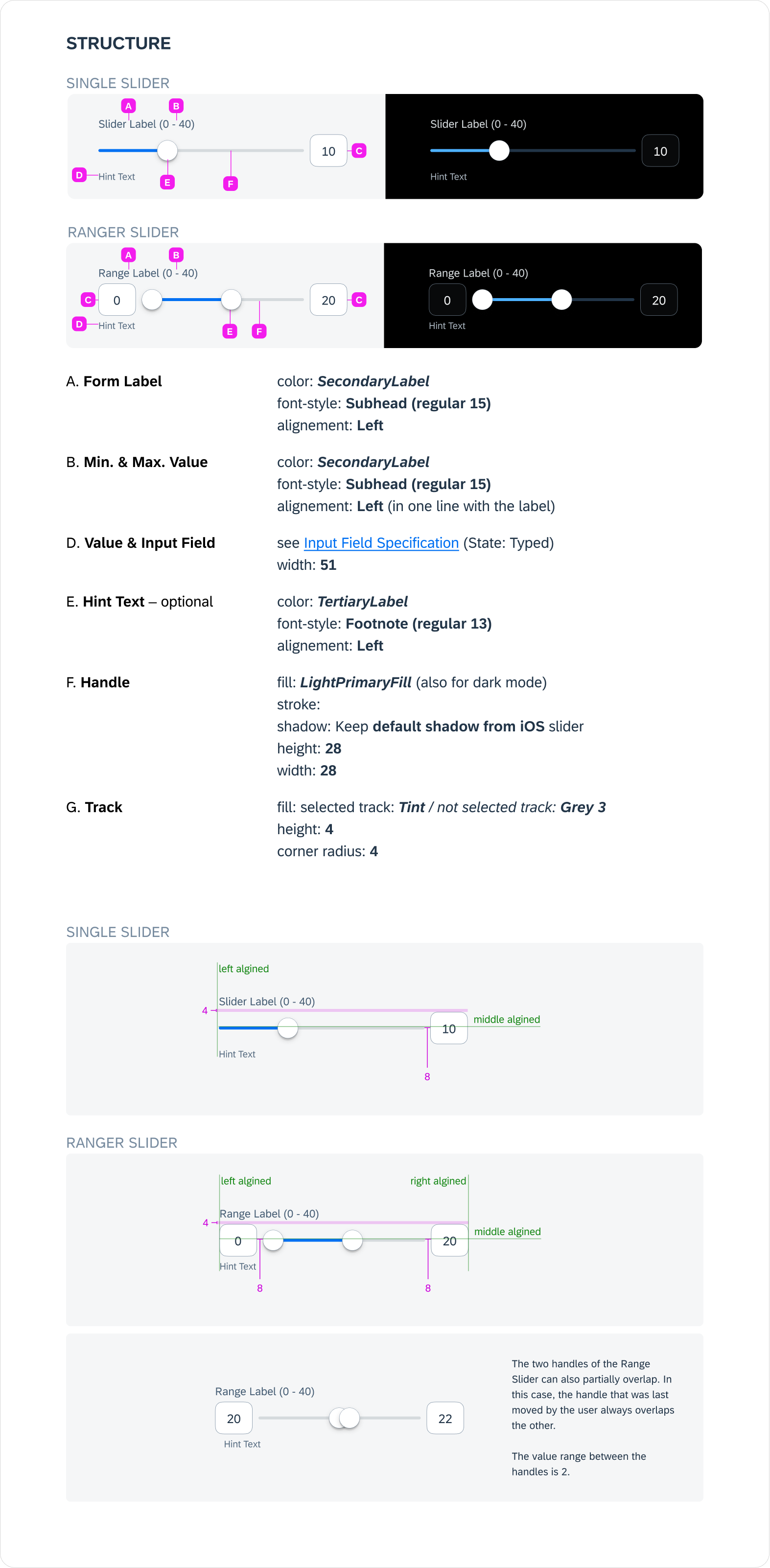
Slider Enhancement
Timeline: 1.5 sprints (about 5ish weeks but also done in parallel with other projects)
Team: Me (iOS Designer & Topic Owner), Yuepei G. (Android Designer), Dana L. (Researcher), and Grace H. (iOS Developer)
Role: I partnered with my Android counterpart to design an enhancement for the existing Fiori Slider form-cell component (slider article to be updated soon). I audited the internal and external component usage across relevant apps & platforms, evaluated the industry standards for sliders, ran divergent explorations/concepts through user research and accessibility domain teams, and finally took all those insights and iterations from the multiple feedback loops to deliver detailed specs and Figma libraries/stencils.
Main stakeholder & Request: SAP Asset Manager (SAM for short), a long-time consumer of the Fiori SDK and MDK, asked for a range selector variant of our slider so that their users could specify/adjust a selected range, not just a single value, from the given range.
Another stakeholder that was interested in this range slider was SAP Concur (Although their mobile app isn't built with the Fiori SDKs they still try to follow our designs).
Summarized UX goals
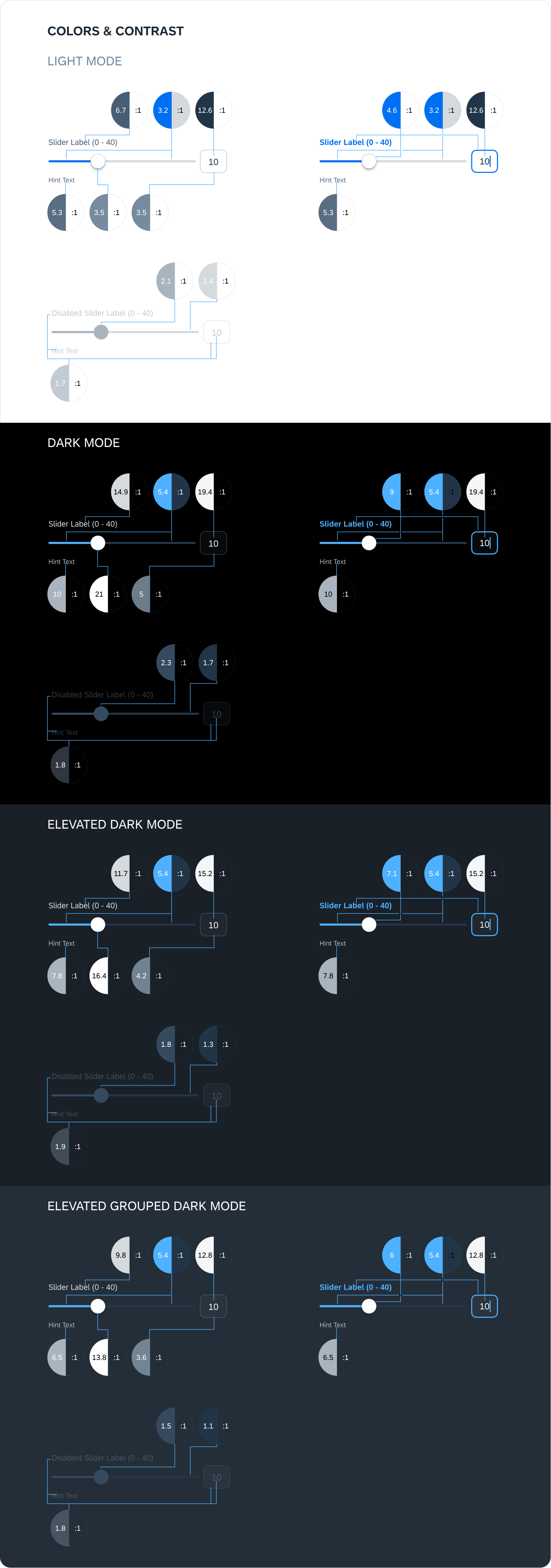
- Add range selector variant + update the single slider
- Use the new Fiori Horizon theming (recent visual style overhaul)
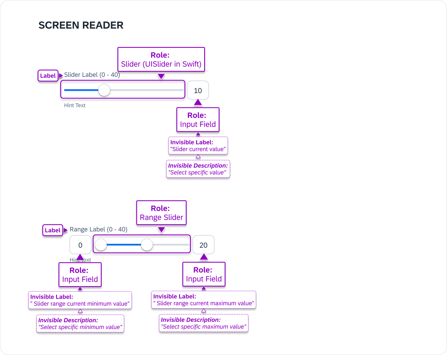
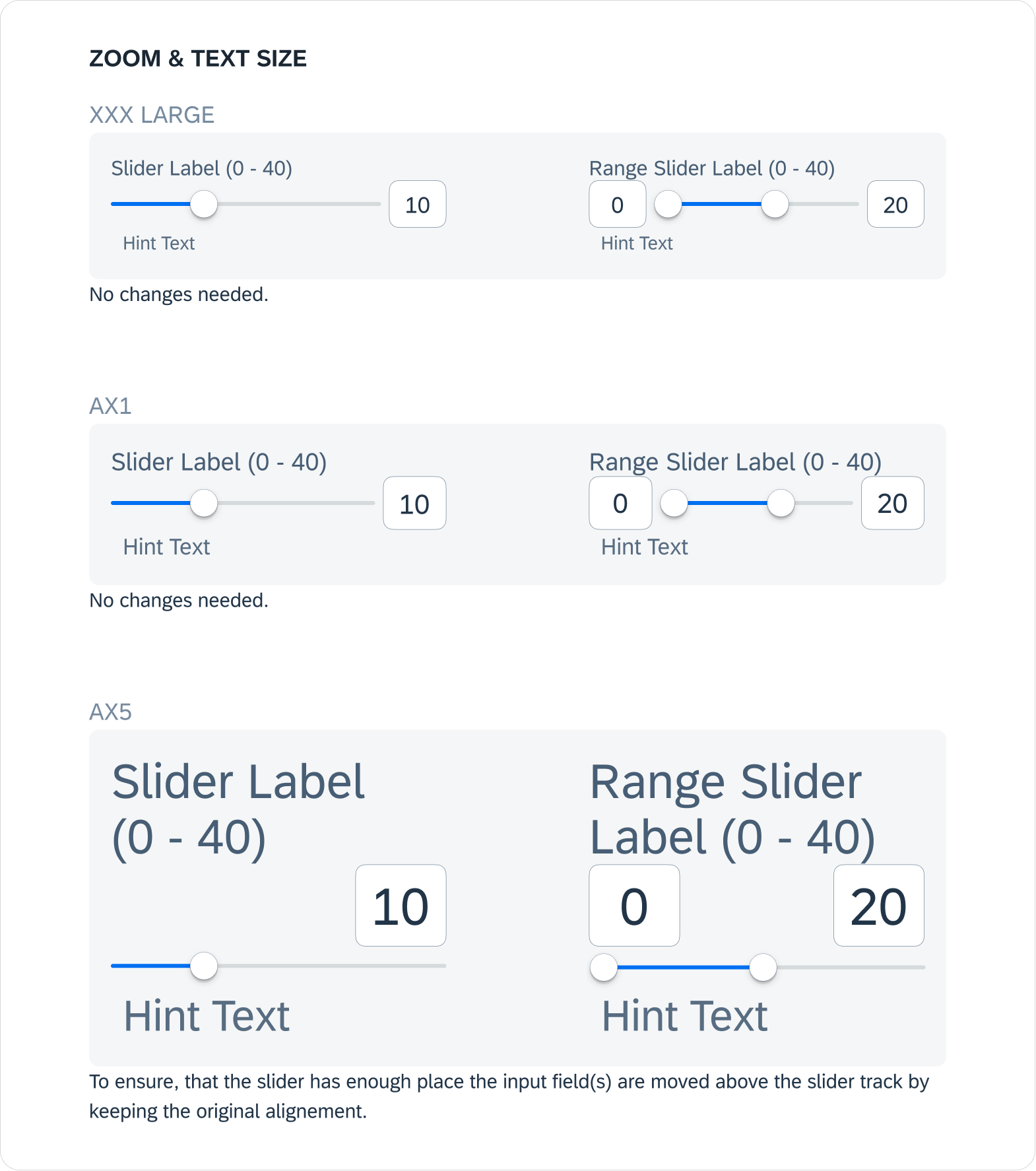
- Improve accessibility and usability (get a pass from ACC & A11Y teams)
- Align functionality with Android and Web
Process Overview

So in this case, the first step was to get a refresh on what the existing slider looks and behaves like, while also looking at the industry's definition of sliders.
We came to the understanding that especially on touch interfaces like mobile devices, selecting a precise value using a slider is a difficult task requiring good motor skills, even if the slider is well designed. So the usage of Sliders is only justified when picking an exact value is NOT important to the user's goal, and possibly providing them with alternative controls.
Slider's Current State
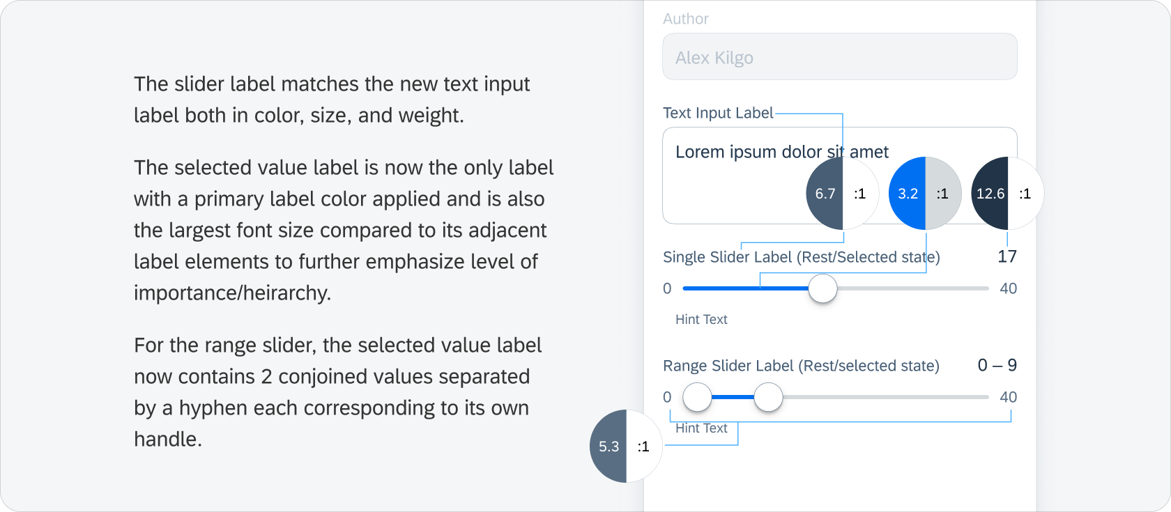
The current slider did not match the new input field form cells (and the slider track height was too small). Its label was in a bold weight and the selected value had the same regular font weight as the slider's min and max values, which 1) no longer matched with the other new form cell components' styling and 2) most importantly had no clear sense of visual hierarchy.
I think more apparent for the iOS version, is that the existing single slider was not cohesive to the above input field form cell.
*If "view more" doesn't work please refresh the page and try again
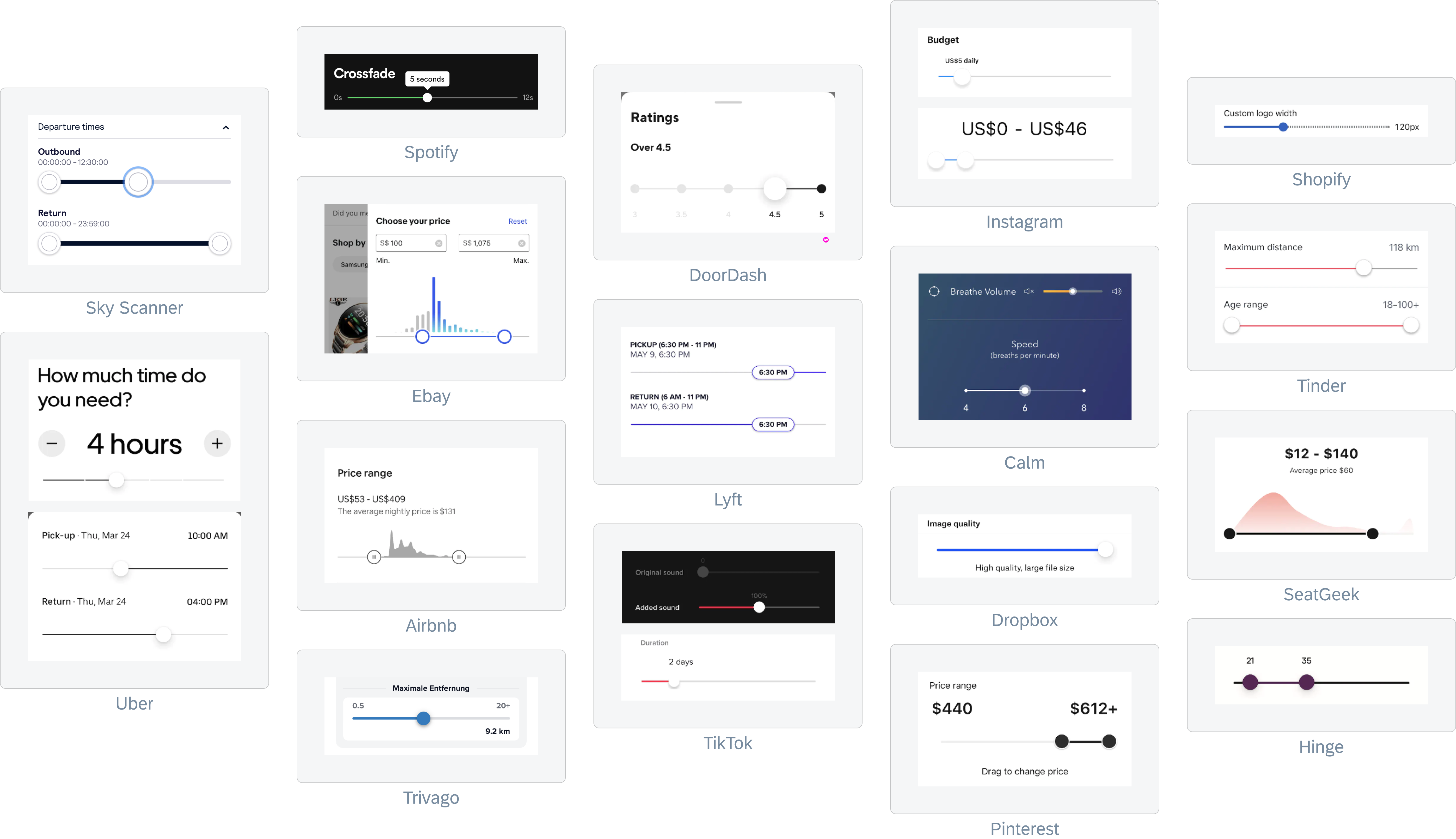
Inspiration
After looking at Fiori's then-current slider designs, I started gathering other examples from popular mobile apps for inspiration (as seen below) for competitive analysis. This allowed me to see how other companies solve for various layouts and behaviors for the same or similar slider component, while also giving me further insights into the particularities of our own slider's use cases.
Design Explorations
It was relatively simple to adapt and mock-up our current single value slider to a ranged variant with a few additional adjustments, but to hedge my design bets I had to try out more divergent explorations. Also, I kept in mind that again sliders were imprecise controls, so having a design that included some sort of input field would greatly improve the component's versatility/usability.
My first instinct was to leverage previous design and make some alterations, while serviceable I still needed to hedge my design bets to ensure that the best design would come out
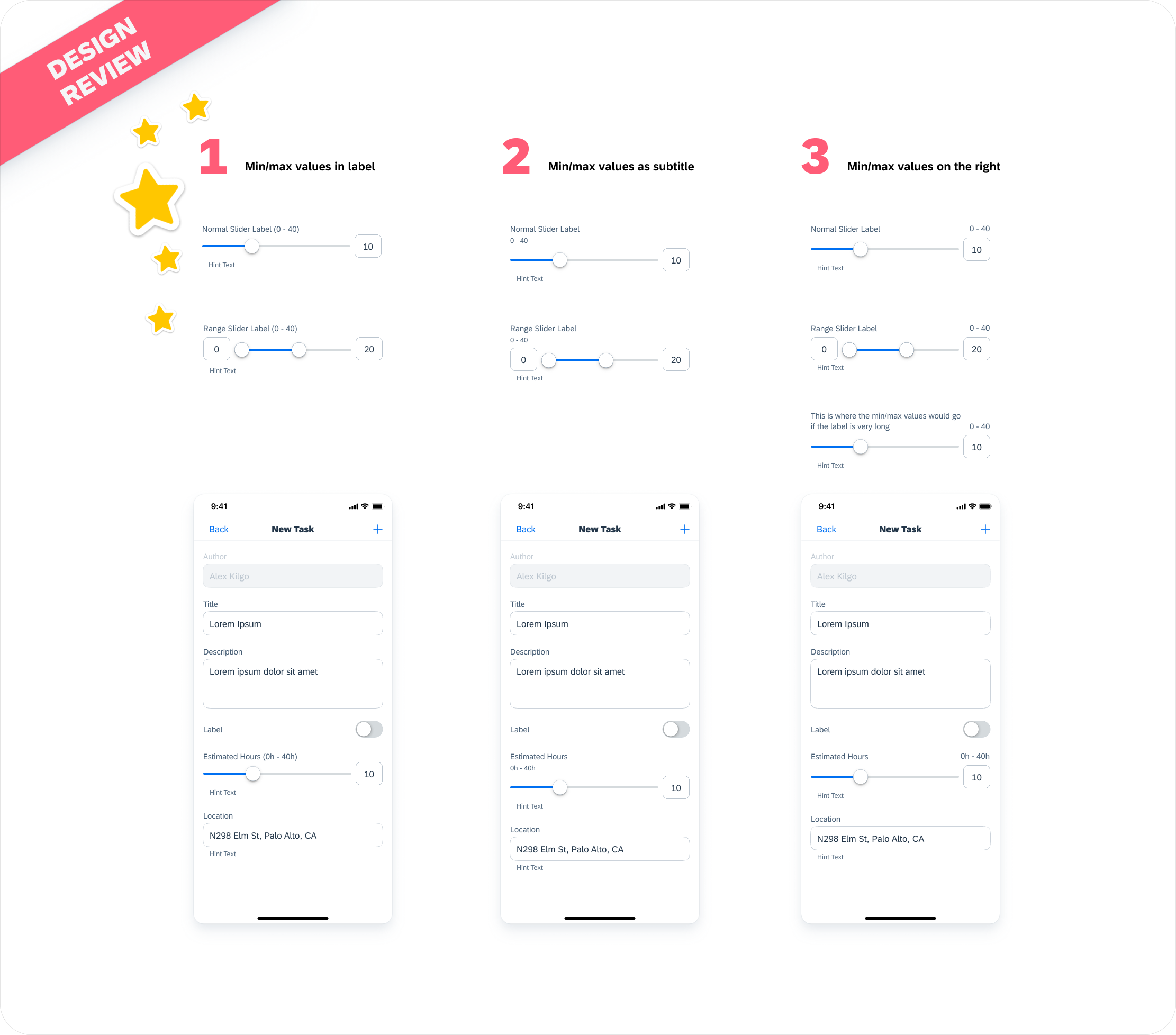
After creating a good number of explorations and iterations (not all shown), I presented some of my top designs to the design team to gather feedback.
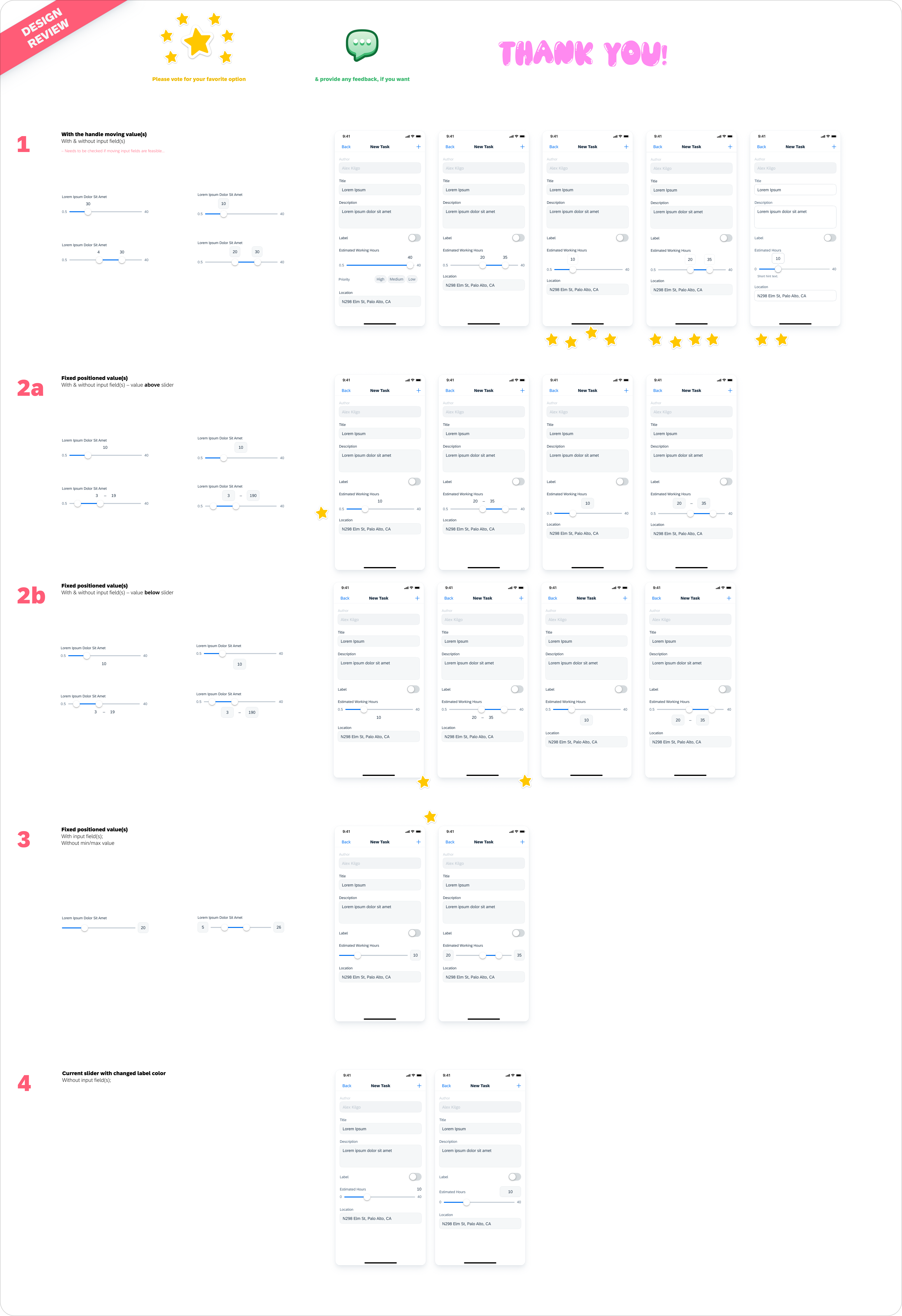
The team liked option 1 the most, with a preference for the label enclosed in a rounded container
I then showed the chosen designs to both the main stakeholder team, the accessibility team, and the SDK development team. SAM was pleased and said that their requirements were met, expressing joy with newly improved visibility with the enlargening of the handle and track along with the selected value labels. Their only slight concern was that the shown option might be taking up too much vertical space, especially since the slider component would be commonly used inside of long forms. The accessibility team also preferred option 1, saying that it was necessary to go with a design that provided a text input alternative to the actual slider handles.
However, after discussing with the development team, we found out that it would not be feasible to implement text input fields that would move in parallel to the drag handles. So then I reviewed and reworked some of the previous designs that could potentially fit the new situational requirements, eventually landing on option 3.
The team resoundingly preferred option 1, with concerns just on the allignment/leftside padding of the hint text
With a direction now set, I went and started designing for the details considering edge cases and behaviors (which you can see in the final designs).
A thrown out range input behavior, because developer said it wasn't in scope :(
Then it was time to do user research to make sure that the designs were usable.
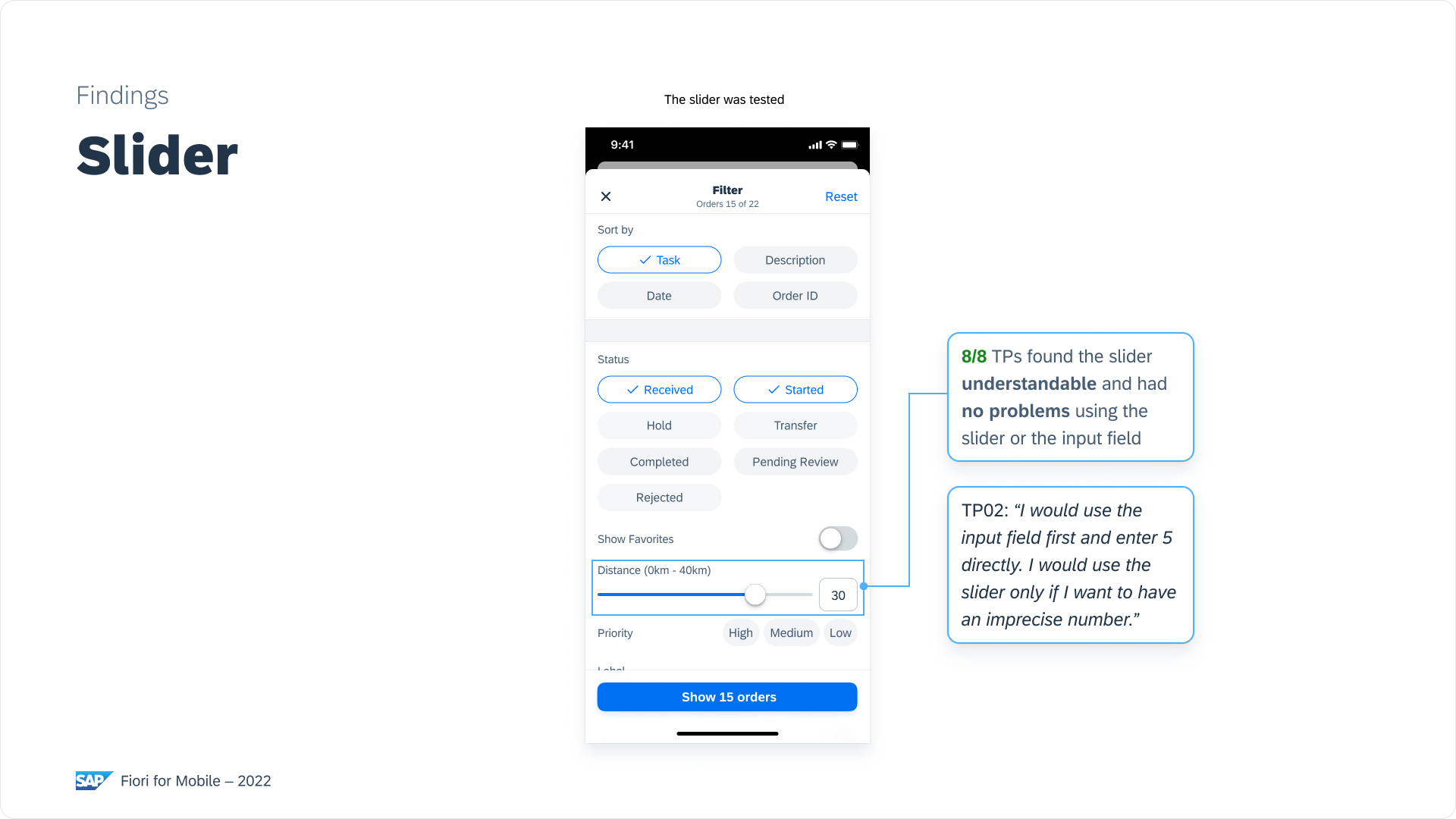
The user research team was able to quickly run some usability studies on our slider components with the interactive prototypes we made. This is just an excerpt of the delivered research findings.
Final Design Delivery
Referencing my explorations, findings, and feedback, I settled on the final designs for implementation delivery.
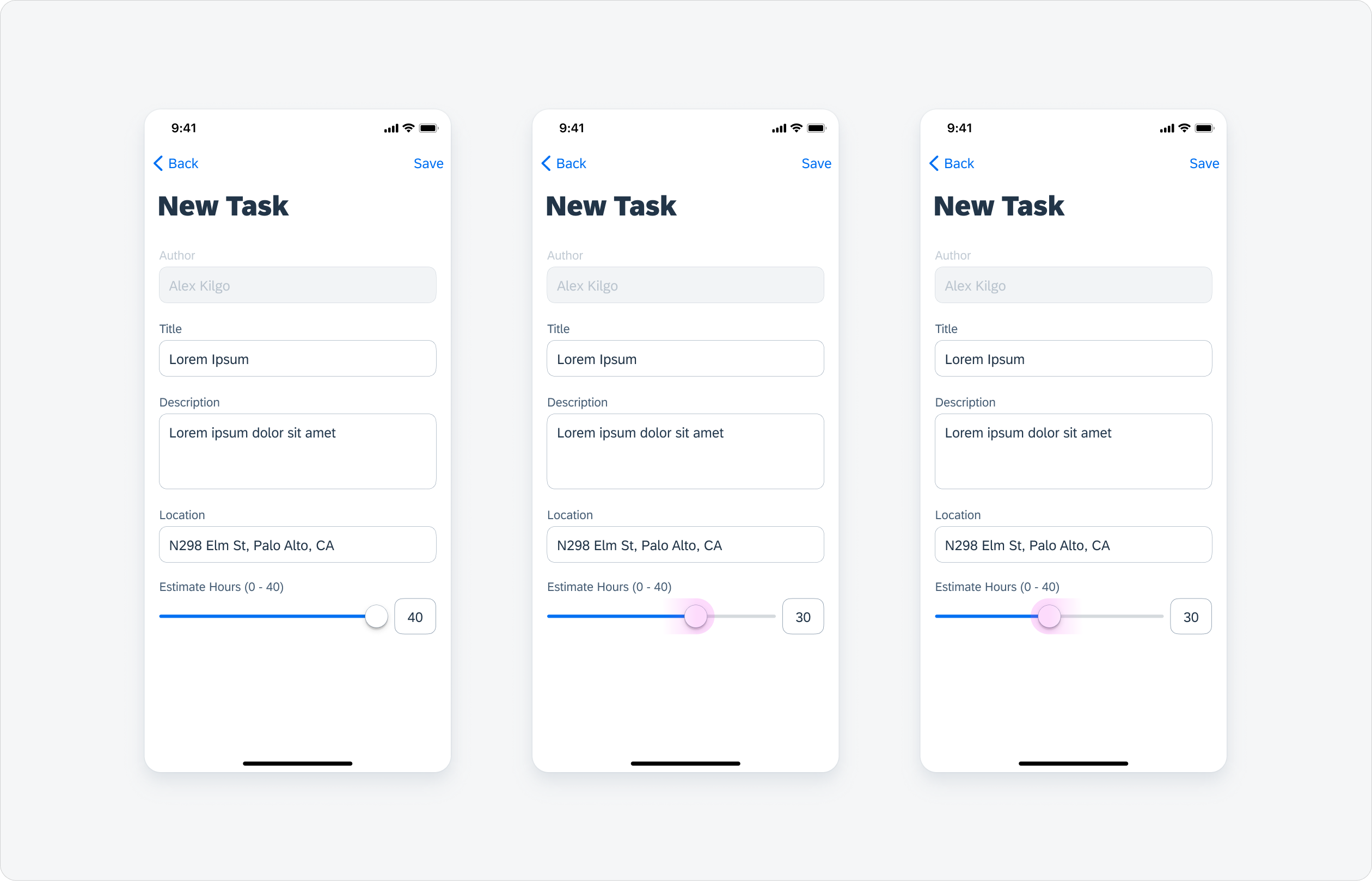
Single Slider - Via Drag
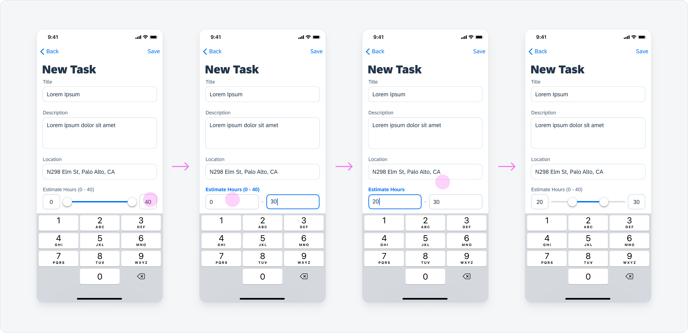
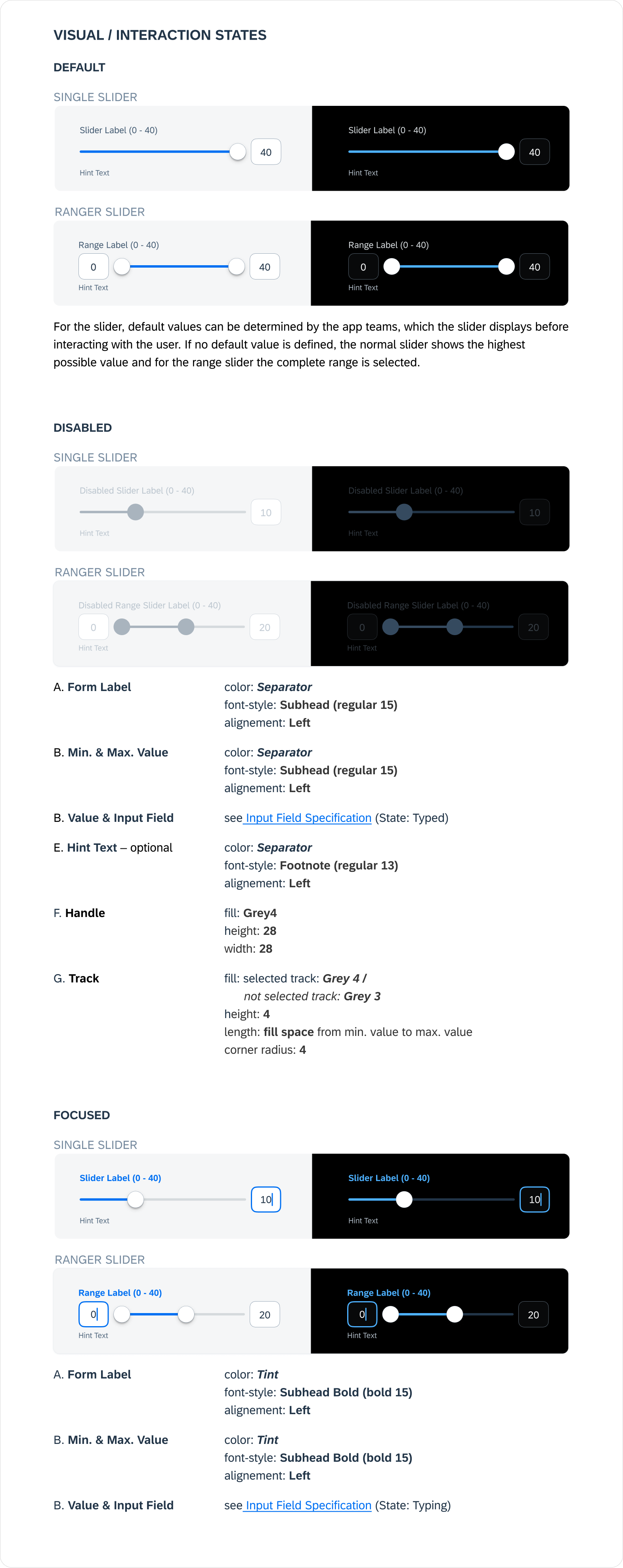
The slider is set to the highest value by default (if there is no other default defined by app teams). The user can drag the handle to the position on the track that represents the desired number and select the value this way. The value in the input field on the right always simultaneously changes with the position of the handle.
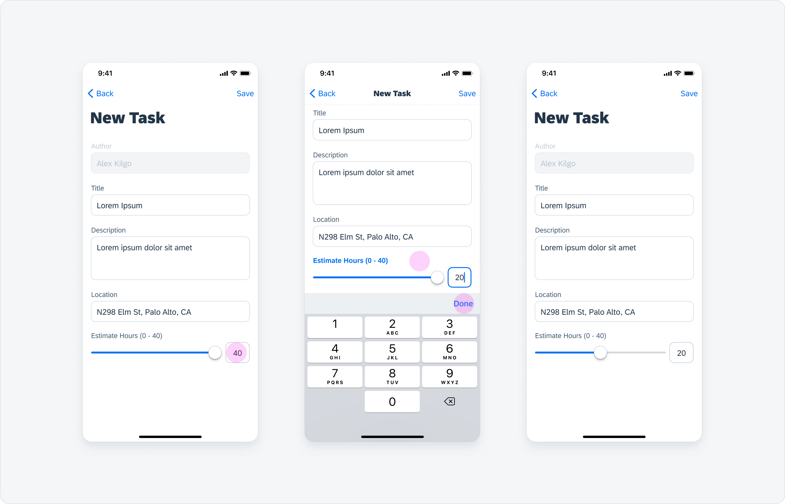
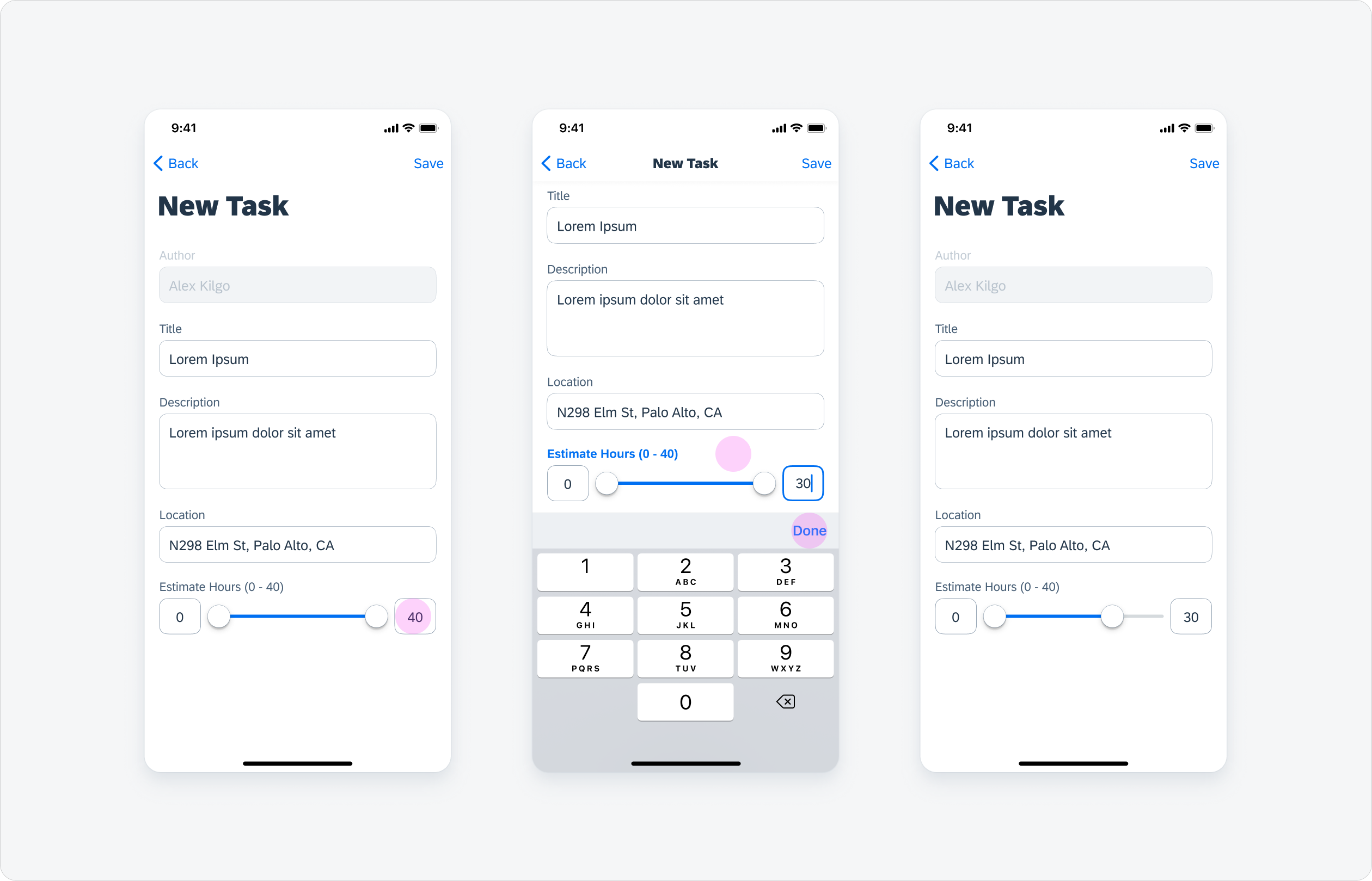
Single Slider - Via Input Field
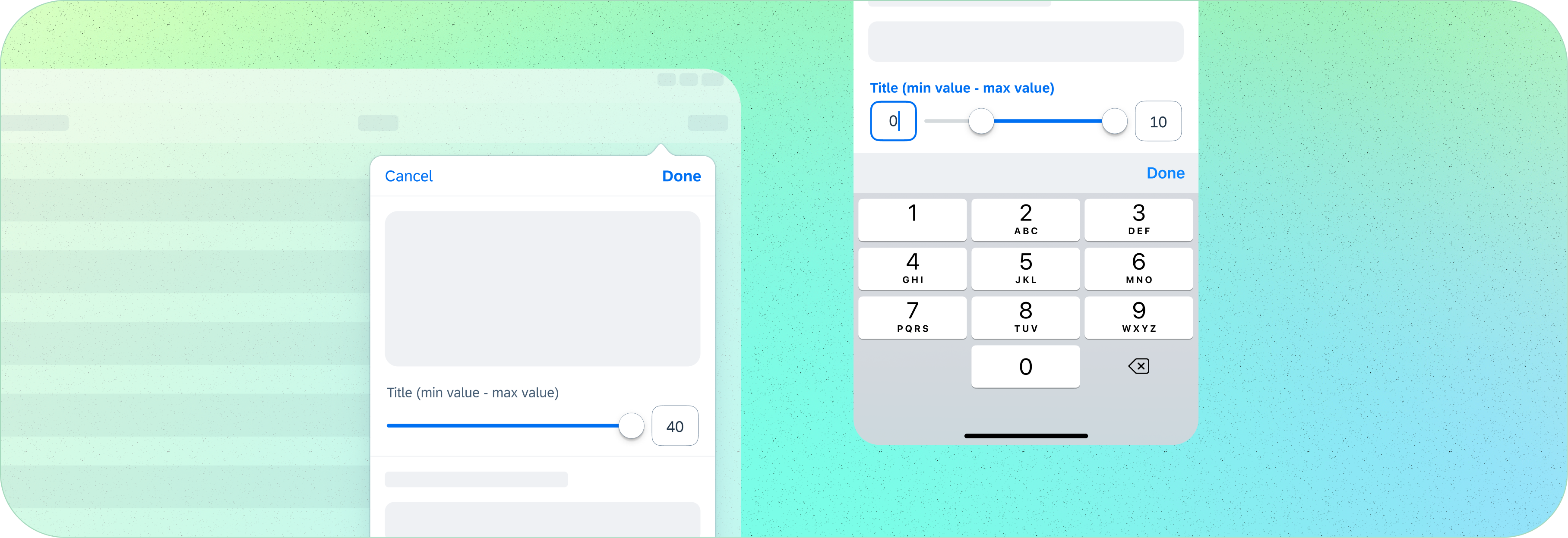
The user can also select a value by using the input field. By tapping on the input field the “typing state” gets activated and the number keyboard shows up. Then the user can type in the value. To set the value the user has to tap outside of the input field. Then the keyboard closes and the handle moves to the new position.
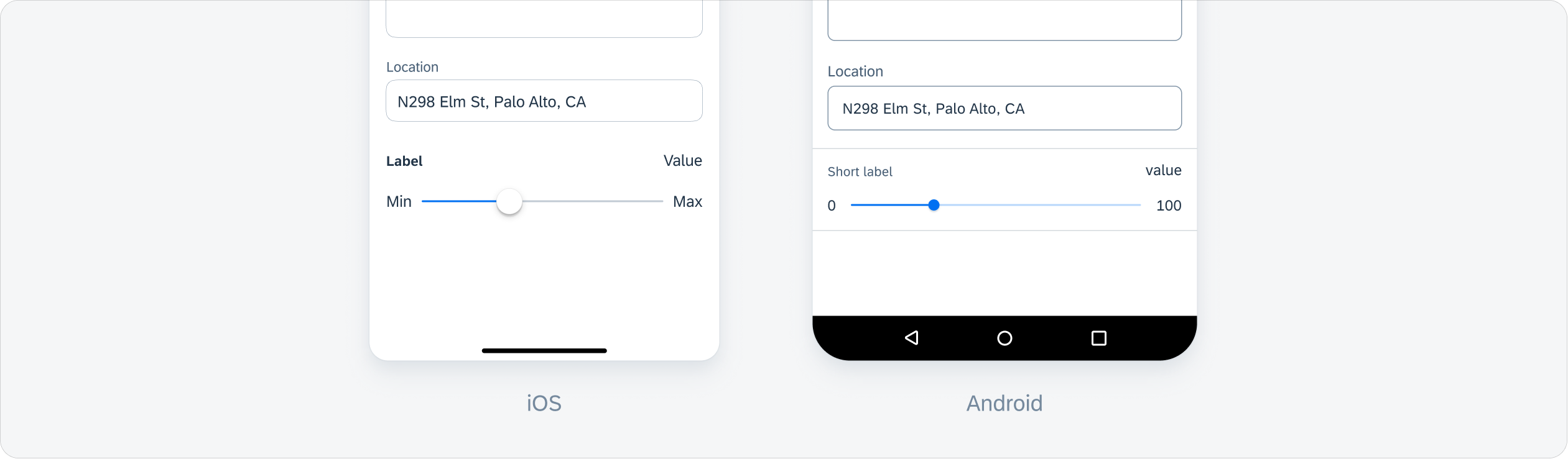
Range Slider - Via Drag
The range slider has the full possible range selected by default (if there is no other default defined by app teams). The user can drag and drop the handles to the positions on the track that represents the desired number for the min/max value(s) of the desired range and select the value(s) this way.
The right handle can be used to set the min value; the left to set the max value.
The values in the input fields simultaneously change with the position of the corresponding handles.

Range Slider - Via Input Field
The user can also select the min/max value(s) by using the input field. By tapping on the corresponding input field the “typing state” gets activated for this one and the number keyboard shows up. Then the user can type in the value. To set the value the user has to tap outside of the input field. Then the keyboard closes and the corresponding handle moves to the new position.
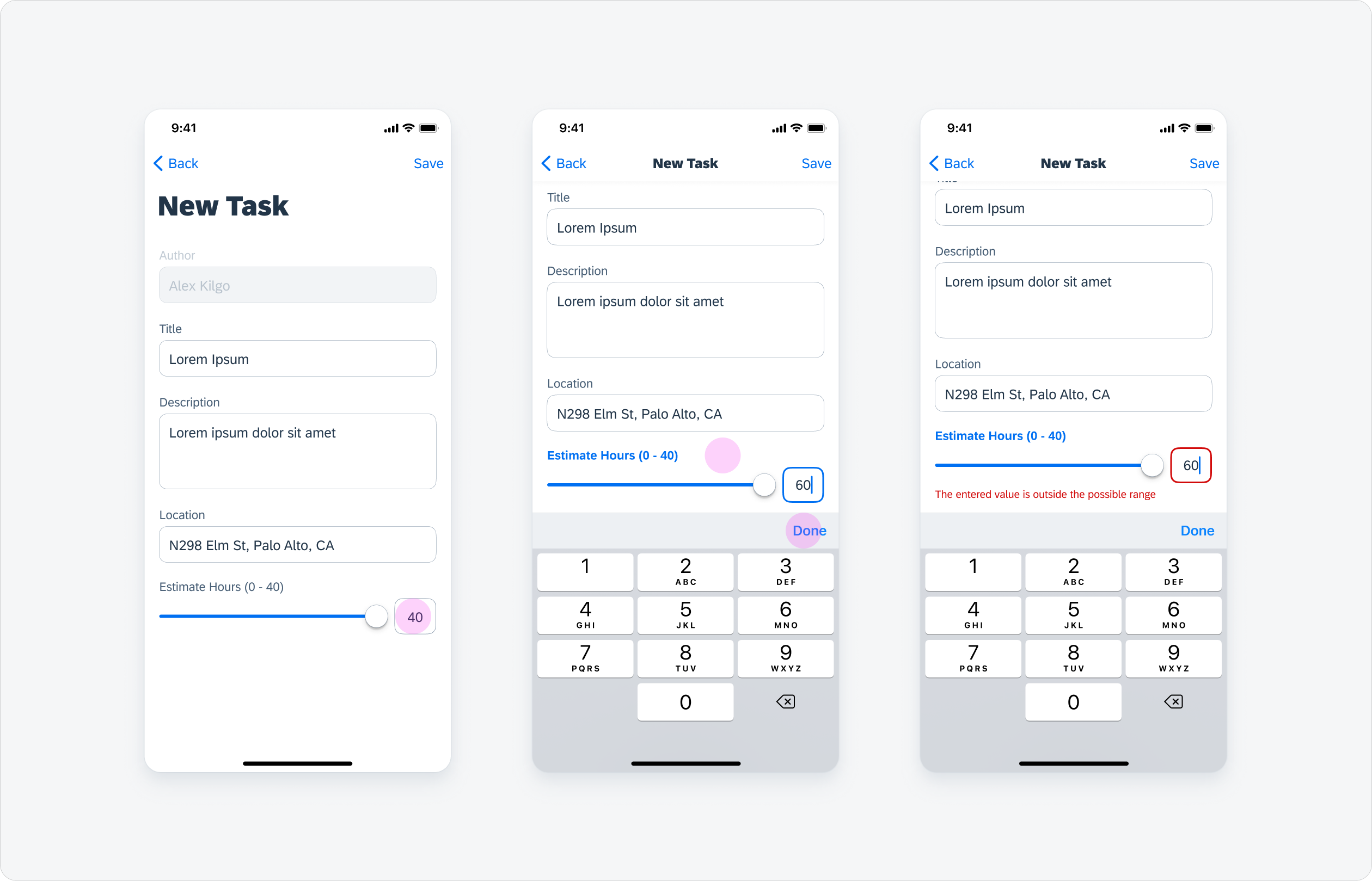
Range Slider - Input Error
With an input field, users can manually enter a value into the field that does not belong in the given range. In this case, an error is displayed using negative semantic hint text to inform the user of this issue.
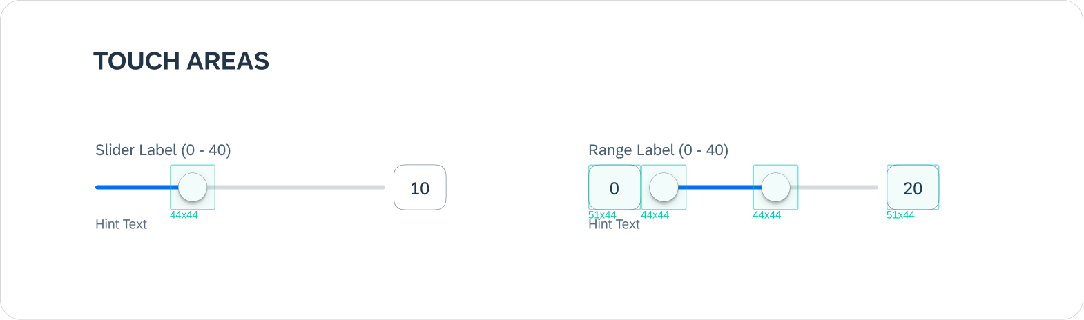
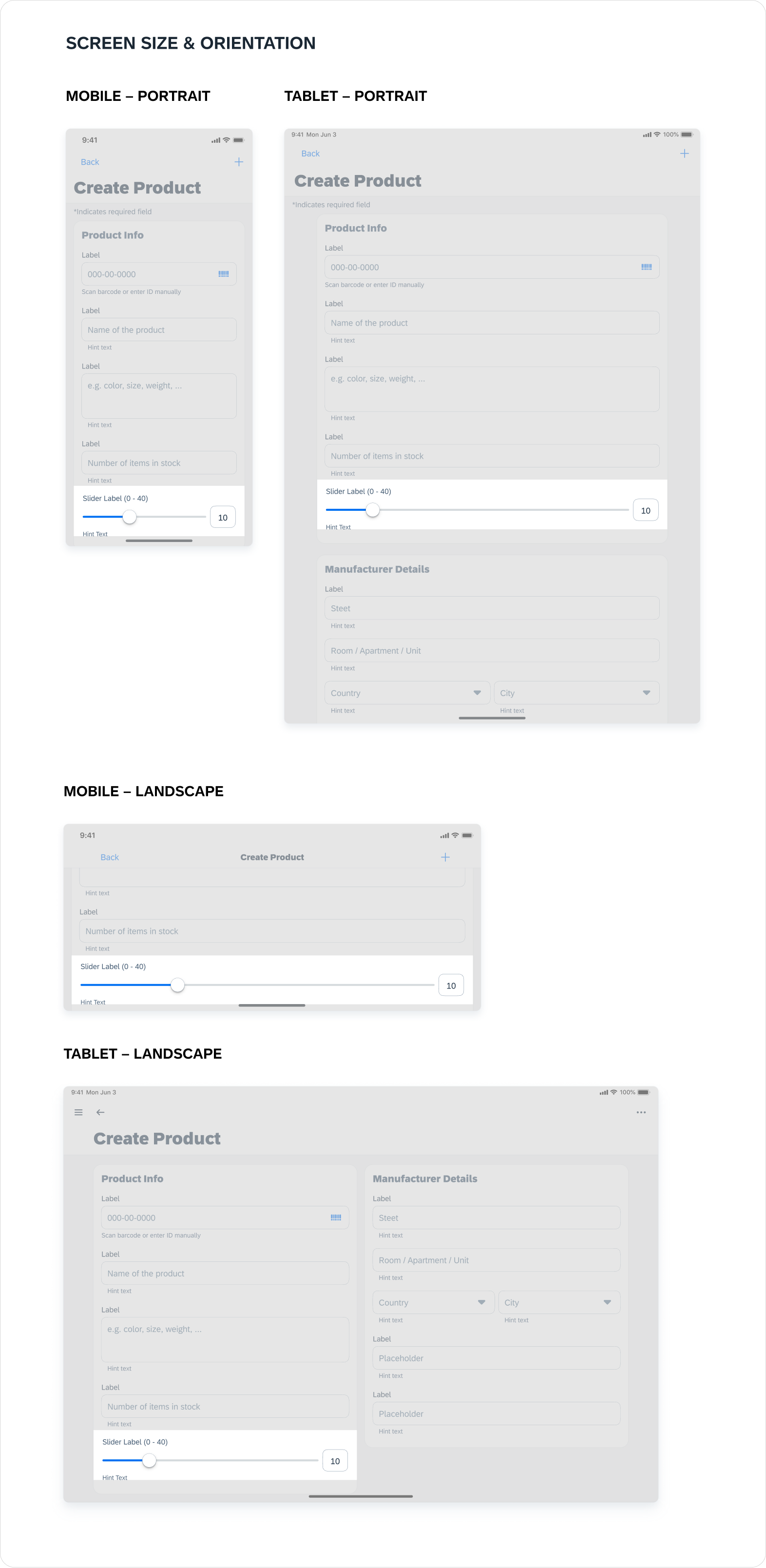
Final Specs
How to use the new slider component in our Figma library/stencil file without detaching stuff :D
Conclusion
This was a relatively minor enhancement to an existing component that had significant changes made compared to the previous design.
Compromises always will need to happen and it's always good to get every stakeholder involved pretty early on to be aligned on the right requirements.
Working with an android designer partner was great since I'm usually spread too thin, but this time we could share project management responsibilities and bounce ideas off each other— both leveraging each other's platform design expertise.
For the next steps, while waiting on the slider's implementation, I'll be updating and writing the corresponding Slider guideline article.
My Projects

MarkThat: Voice Powered NotesProduct Design, iXD, Prototyping
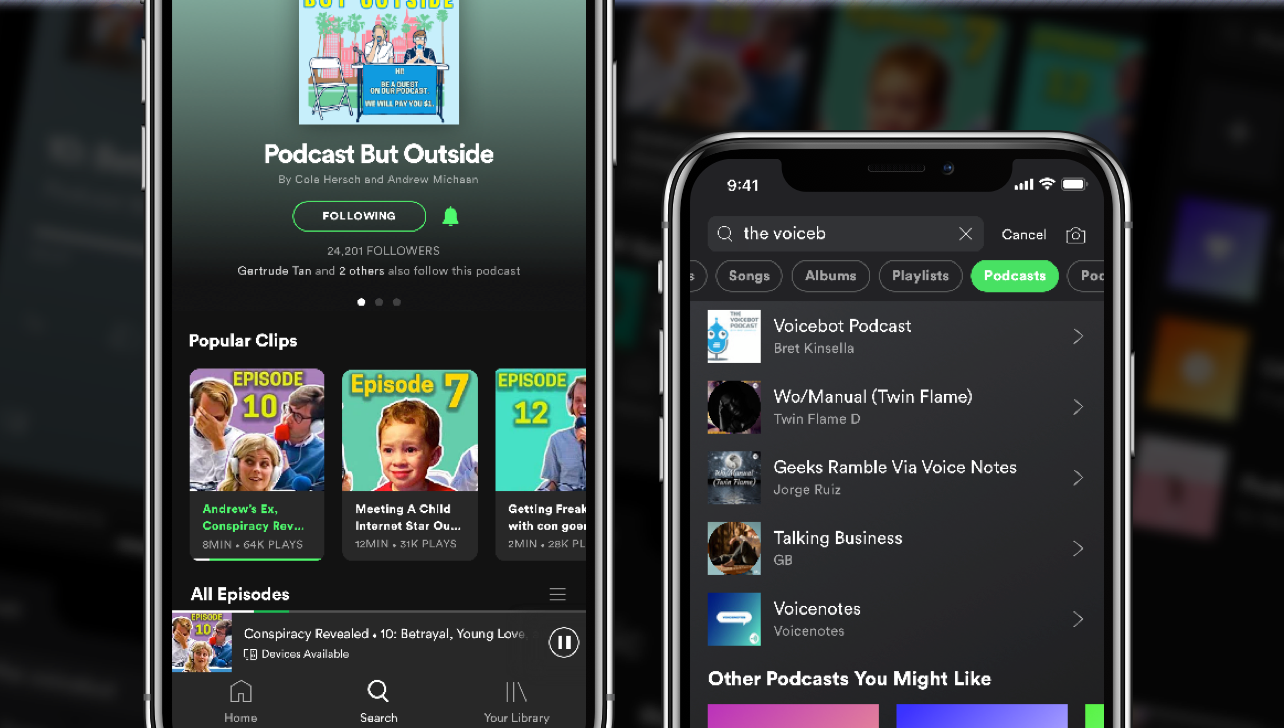
Spotify Podcast RedesignProduct Design, iXD, UI Design, Prototyping
Fiori Design System and more @SAPProduct Design, iXD, UI Design, Prototyping
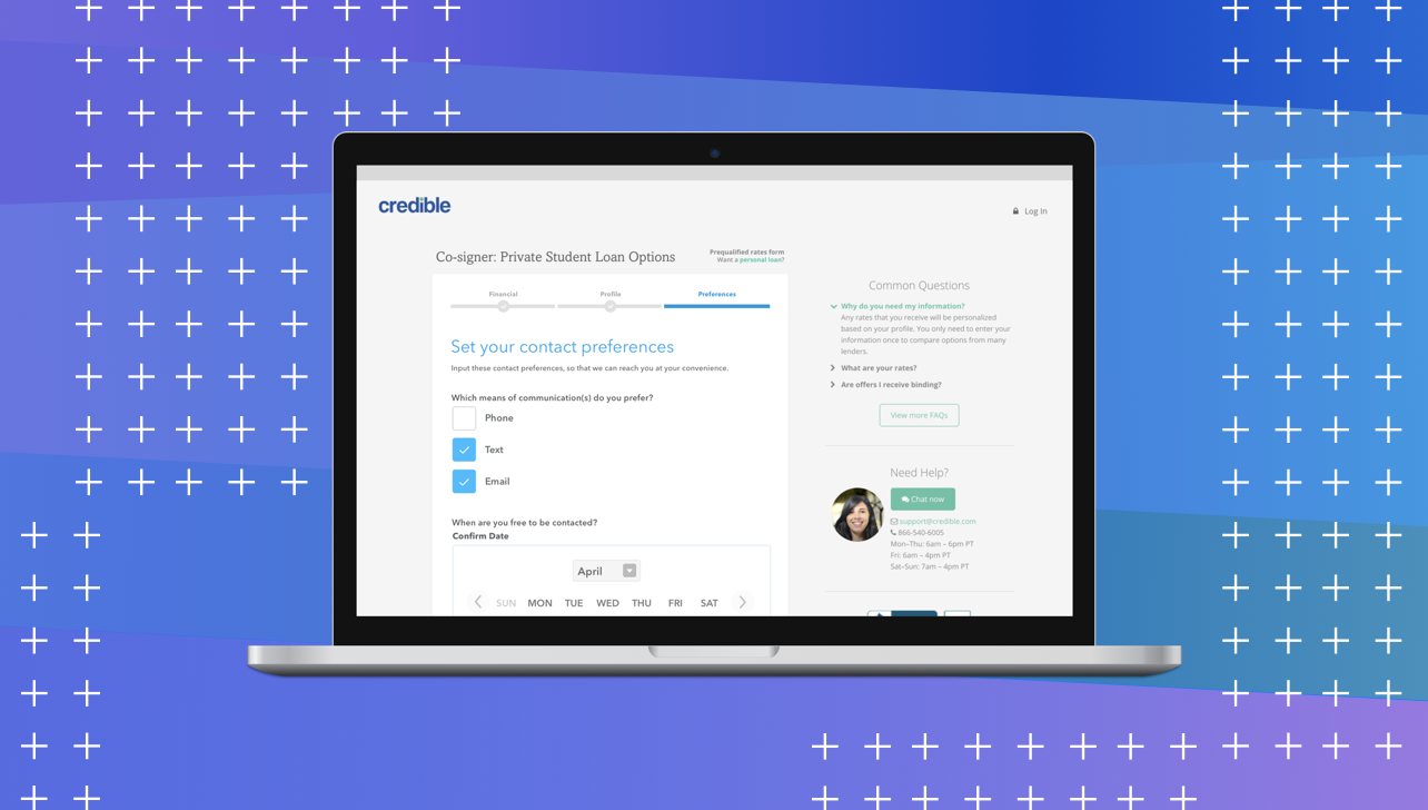
Credible — Contact PreferencesProduct Design, iXD, User Research

UCSC HCI Lab — EmotiCalResearch, UX/UI Design, Development

Voice @Yahoo!VUI Design, UX Research, Prototyping