INTERN PROJECT
Personalizing customer service with contact preferences
Talk on your terms
Introduction
Some context and description
Many people, myself included, have specific preferences on how and when to be contacted. If they were to receive a call at an inconvenient time — during work, a commute, a nap, etc. — or are just prone to checking other means of communications — text, email, smoke signals, etc.—, they are encountering forms of bad customer experience, which should be as frictionless as can be to avoid the risk of any customer churn.
Like any other aspect of a company’s offering, customer experience could very well be the reason why a person decides to choose said company over a competitor or vice versa. It is important to control how a person receives and perceives the entirety of the product and service.
Contact Preferences gives Credible clients the ability to set their own preferred means of contact/communication. This feature would provide the Client Success Team with more information on how to build personalized customer experiences and lower customer churn.
Some Context
In the summer of 2017, I worked at Credible Labs, an online student loan marketplace.
 Company
Credible Labs Duration
Aug - Sep 2017 What I did
User Research, Product Design Advisors
Jereme A., Bena L., Mark H.
 Tools
Tools
Sketch, Invision
Overview
Lets talk terms
The Problem
People have their own busy schedules and inclinations towards different forms of contact. More specifically, customer attrition during Credible's conversion flow due to poor contact interaction and inconsistent communication.
Applies to many contexts, but communicates how we communicate matters
The Solution
An addition to the prequalification form — Credible's initial form that determines a user's loan eligibility — that would allow qualified users to provide their availabilities and contact mode preferences.
Understand
Define, learn, and empathise
So I started out on this design with a hunch that people prefer different means and times of contact — sure I could have poured over the data to find an apparent problem, but I like taking more of an instinctual approach initially.
Research
With a little research, I found some prior research/data on the subject that was very closely related to the problem I was attempting to design for.
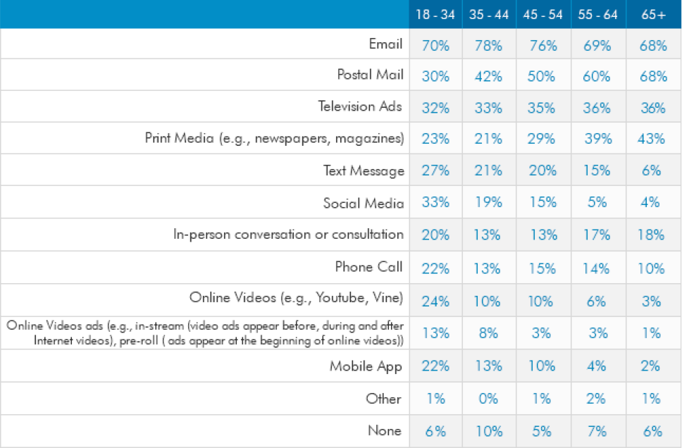
Taken from marketingsherpa, where they conducted a survey to find out how they would like to be contacted by companies grouped by age intervals
Some further research lead me to studies about Representational Systems — the models and methods regarding how the human mind processes and stores information.
Experts in this field were able to identify 7 key strategies (auditory external, visual internal, visual external, etc.) and the order of steps taken during a cognitive task. They also believed that people each develop a more highly valued strategy or system in which they are more able to vividly create an experience in their mind. Which lends credence to why people prefer different ways of being contacted.
So armed with what I believed to be a problem and the beginnings of a few hypotheses, I needed to validate my suspicions.
Audience
For the purposes of controlling the scope of this project, I have focused the design around the Credible's student loan product. This constrained my target users to students (either undergraduate or graduate) and any cosigners that they may have. To further narrow my target down, I chose to focus on just the cosigners ‘ and their user flow (since the bulk of the submissions to Credible were for undergraduate studies — situations in which these students often required a cosigner)
Observations and Interviews
I believe that people generally know what they want, but fail to communicate it. So part of a designer’s job to take said “want” and articulate, improve, and create it. And it’s this belief in how product development is driven by the user, that to gain a more in-depth grasp of the product and it’s users, I asked if I could collaborate with the Client Success team near the end of my time with Credible.
Mistaken call recipient/availability was something that most Client Success Specialists (Callers) encountered. Some users listed shared phone numbers (usually the home phone) as their personal cell number, which resulted in leaving messages to call Credible back with the mistaken call recipient (usually unverified to discuss important matters in detail).
One interviewee mentioned that they only had access to the listed phone number at certain times, stressing that they had specific times of availability. With Credible’s existing calling procedure, callers would continue to almost harass client’s with calls until some form of contact was made (which prompted some clients to believe that Credible was a scam due to the spam-like manner of calling).
Inconvenient times were mentioned and noted repeatedly (for instance, receiving calls while at work). These times of inconvenience varying in cases, and at times prevented the callers from successfully communicating the necessary information, thereby wasting time for both caller and call recipient. For some recipients, the calls greatly annoyed or disrupted their daily schedule, and would voice/lodge their distaste for the poor customer service.
Callers noted that some clients would only respond to specific means of contact. Knowing a client’s contact preferences would allow for quicker response rates and more detailed care through the customer funnel.
Data Analysis
With help from Jereme A. (Operations Manager) and Mark H. (Engineer), I conducted an analysis with Salesforce, RingCentral, and Looker data which further confirmed the hypotheses and findings formed from the Client Success Teams.
This deeper dive into the product’s actual data proved to be extremely valuable to me. I gained a better understanding of all the key metrics I needed to keep in mind, allowing me to identify KPIs that would inform my success.
Key Findings
- Clients have different times of availability and access to means of communication throughout the day
- Clients respond to preferred means of contact
- Unorganized and spam-like nature of calling system deterred harried clients
- Both clients and callers waste time and effort from non-personalized customer service
Use Cases
Based on my research, there were three possible use cases for the Contact Preferences feature, in order of importance.
Setting Times of Availability
The user wants to set their available times to be contacted.
Setting Communication Preferences
The user wants to set how they are contacted (phone, text, and/or email).
Setting Contact Intervals
The user wants to set how often they are contacted depending on set factors dependent on their progress in the user flow.
Generate & Evaluate
Ideate, visualize, and iterate
Now armed with research insights, I started brainstorming potential solutions. The feature would have to work with the existing complex user/system flow.
I had to discuss with our Salesforce Engineer, an Automation Engineer, the Product Designer in charge of the prequal flow, and Operation Managers to map out the current experience and what would be feasible to add.
Use Cases
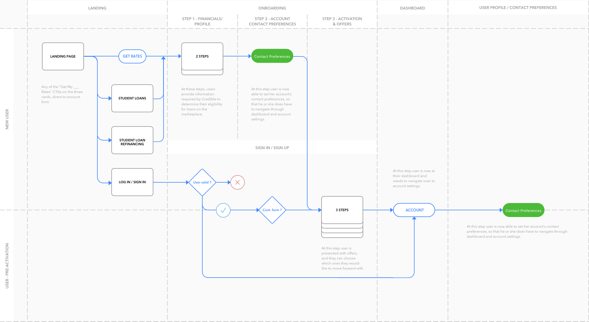
The green labels are where I inserted ‘Contact Preferences’ into the flowchart, the step labels are to greatly simplify flow
To avoid undertaking too much of an ambitious solution (a better alert system that integrated with set salesforce system, convergence funnels, and calling schedules), I constrained my design goals to providing clients (specifically co-signers) with the ability to set their schedules and preferred means of contact.
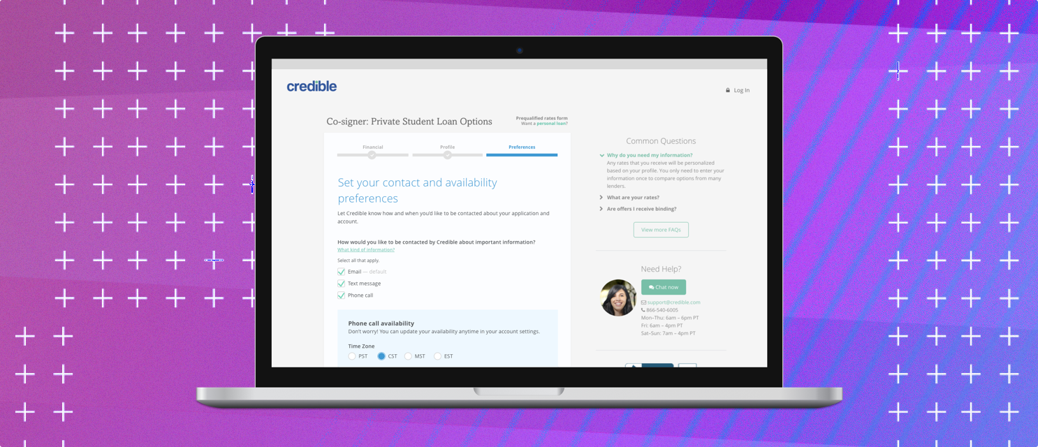
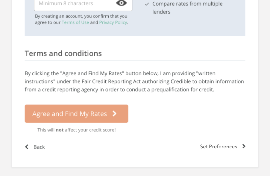
I converged on the idea of adding more entry fields in Credible’s initial ‘on-boarding’ form submissions — as seen in the flow chart above. Originally, the form submissions only asked for basic personal and financial information; however, now near the end of the form process clients will be also prompted to enter their contact preferences, which keeps the experience consistent and flowing.
Example
However, thanks to some feedback and brainstorming (Shout out to Jereme!), I found out that credible’s calling schedule/format inputted users into the Client Success calling list as soon as they were searching for or presented with offers. So I instead opted for the design below, so that we could focus on creating a better experience with a better conversion rate in the long run.
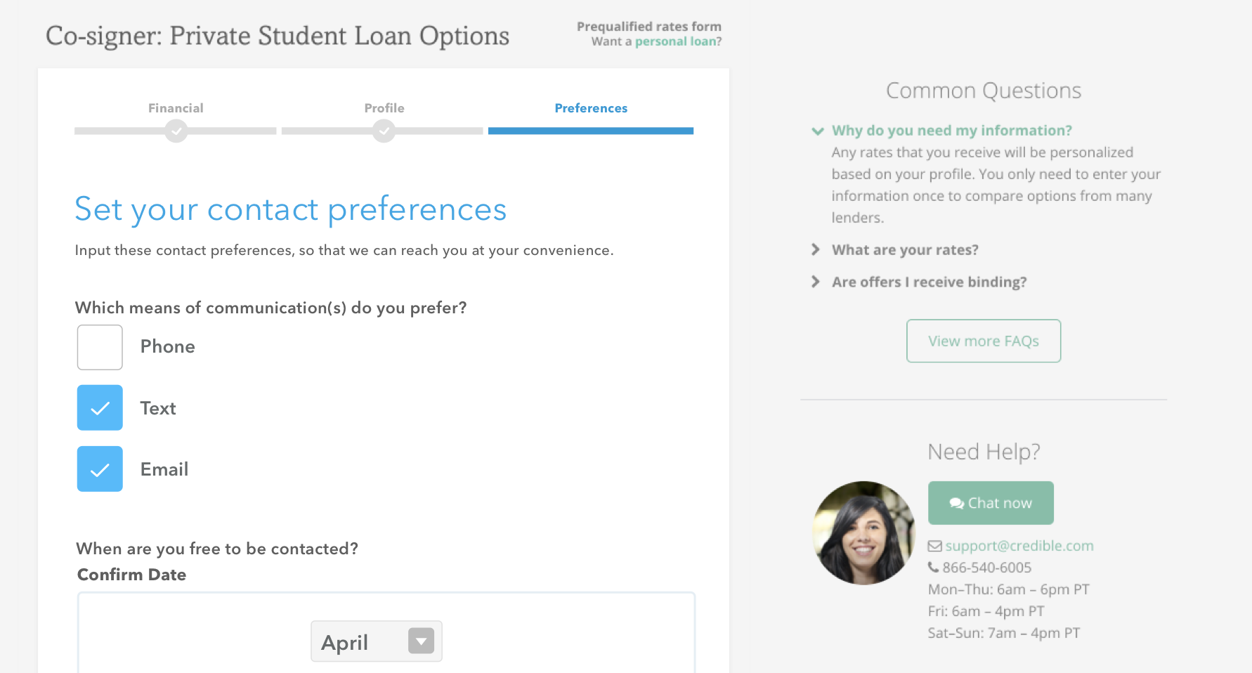
Designs
The ratio of the designs below may look off, especially for a web app; however, they are missing the footer and side container with extraneous information as it pertains to this article and design.
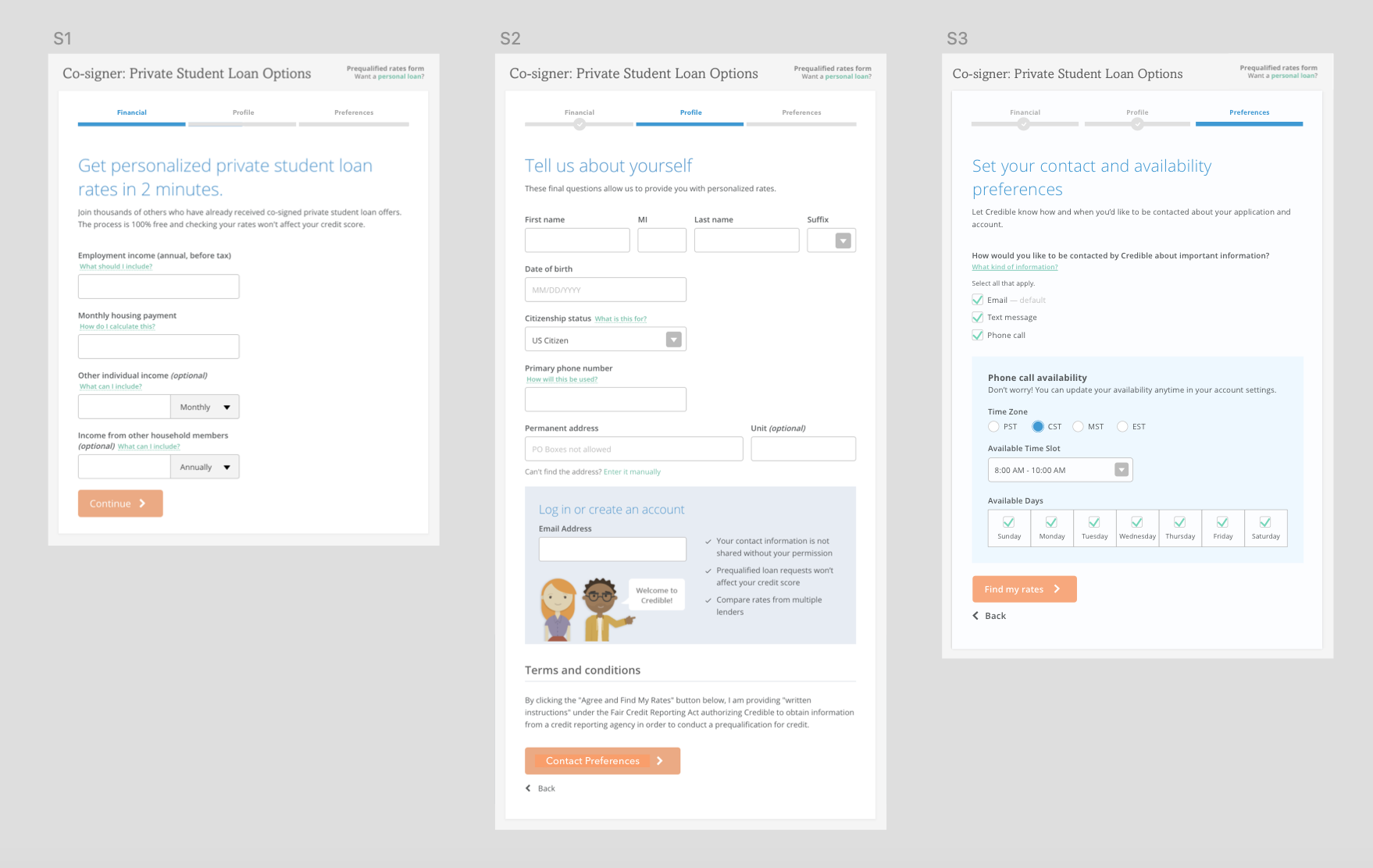
Pre-qualification form user flow with S3 as added screen
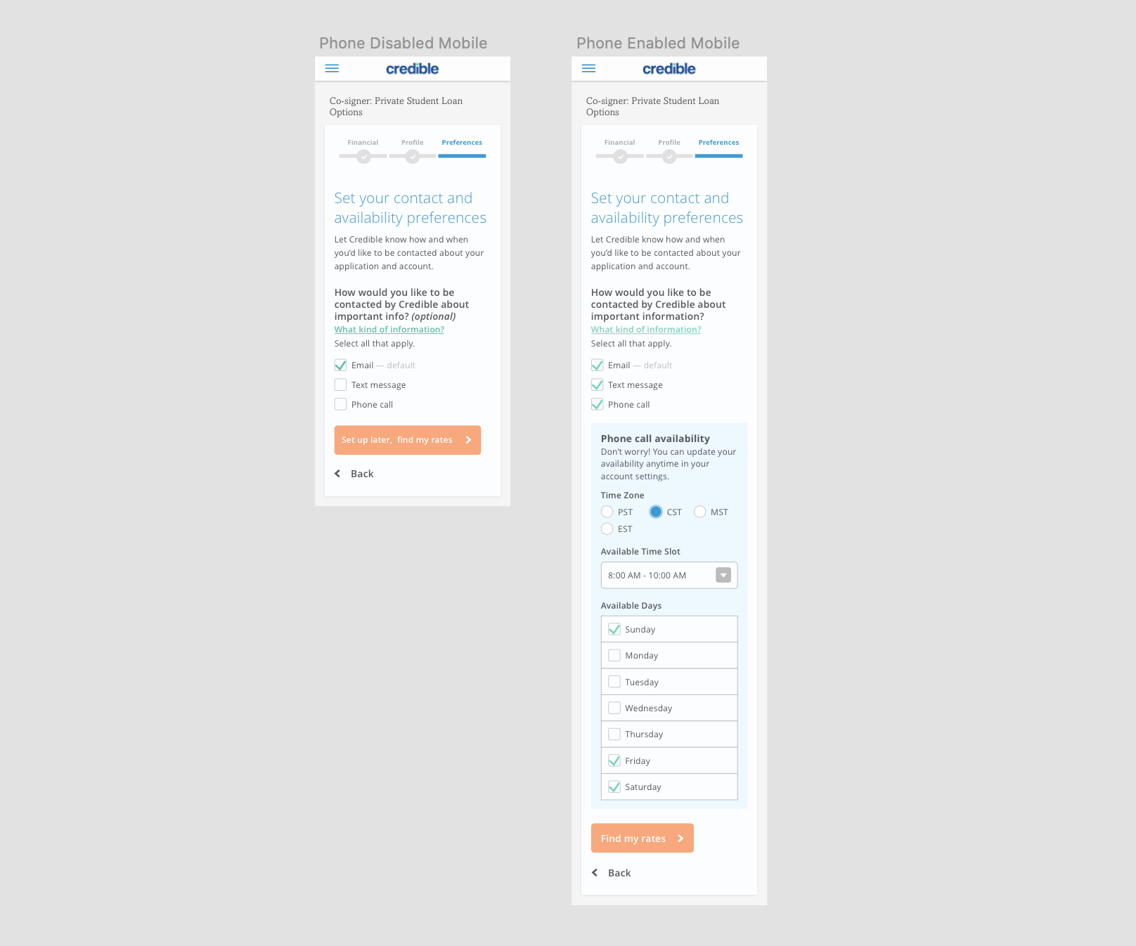
Mobile design versions for responsive design
The ratio of the designs below may look off, especially for a web app; however, they are missing the footer and side container with extraneous information as it pertains to this article and design.
Conclusion?
Challenges, takeaways, and next steps
I learned a ton from this experience. Just having the opportunity to work on and flesh out an idea I had as an Intern and being able to work with so many talented people, really taught and inspired me. I learned to balance qualitative and quantitative research and analysis, communicate between cross-functional teams, and how a moderate-sized startup runs.
This was done near the end of my term at Credible. Given more time, I would have liked to see the full development all the way through.
Goals would have been to work with the operations/client success managers to develop improved calling procedures and aid the design and engineering teams to A/B and Q/A test my solution to further iterate and better the product/experience.
To think that this project started from a timid slack to the VP of product and the subsequent attending of design meetings really just shows how taking the initiative pays off.
If you made it this far, thanks! I really appreciate you reading this and just know that I’m always watching… just kidding
My Projects
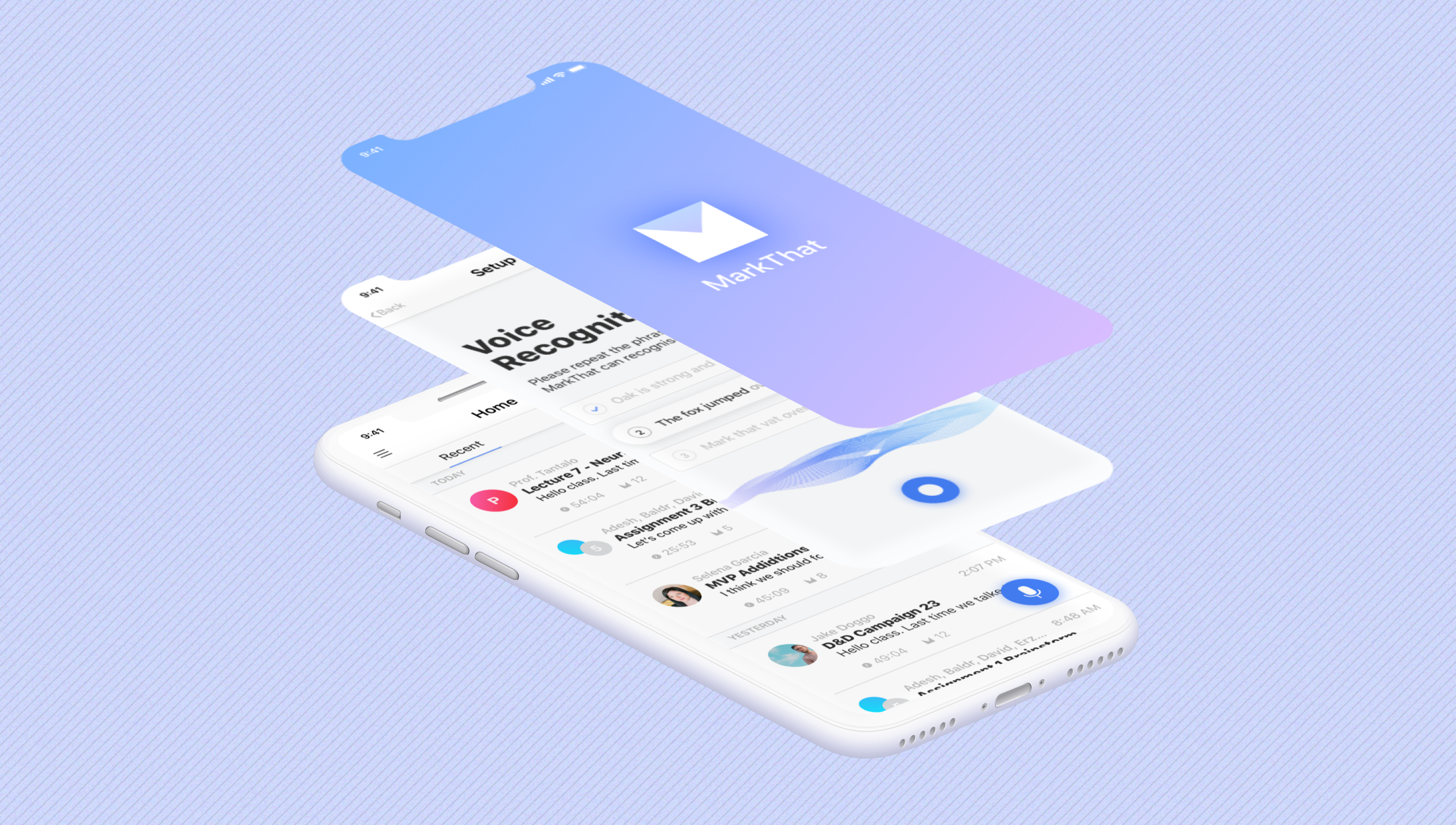
MarkThat: Voice Powered NotesProduct Design, iXD, Prototyping
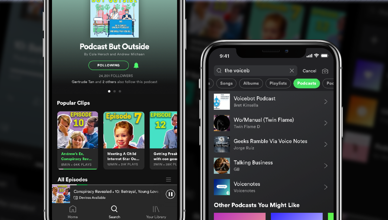
Spotify Podcast RedesignProduct Design, iXD, UI Design, Prototyping
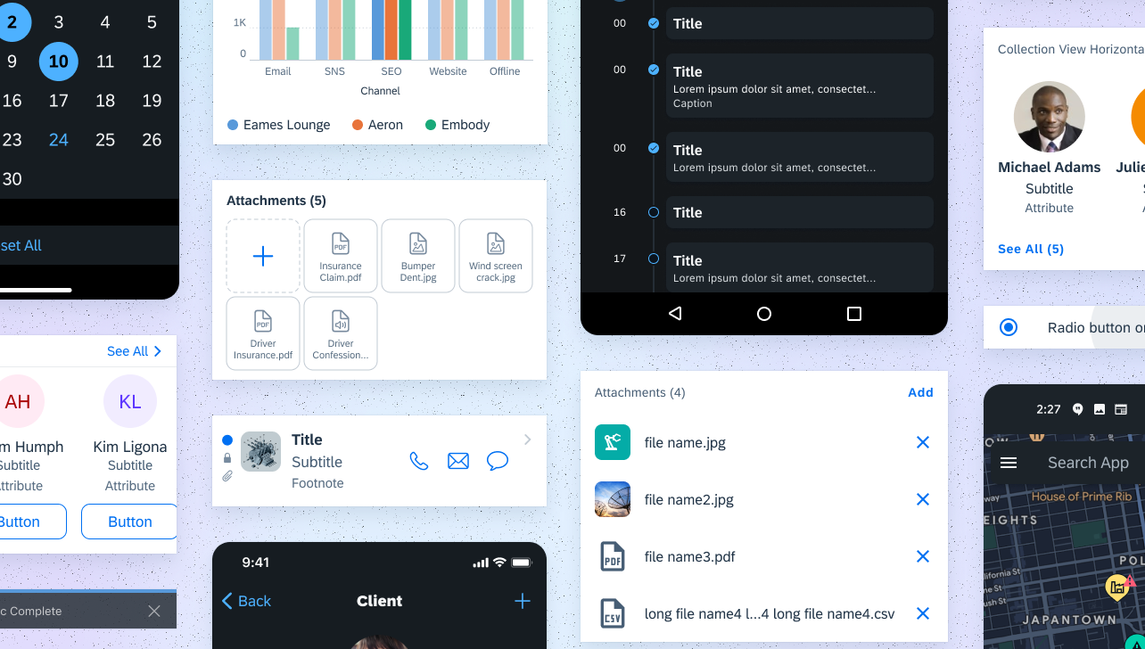
Fiori Design System and more @SAPProduct Design, iXD, UI Design, Prototyping
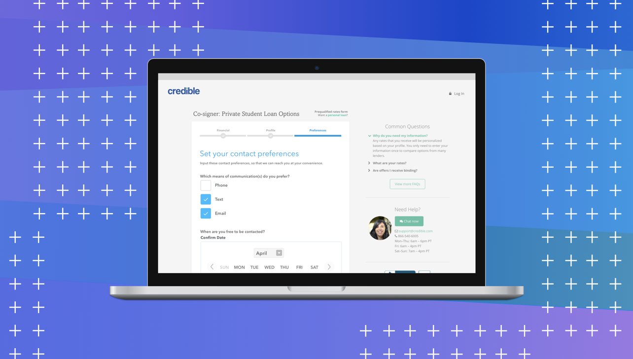
Credible — Contact PreferencesProduct Design, iXD, User Research

UCSC HCI Lab — EmotiCalResearch, UX/UI Design, Development

Voice @Yahoo!VUI Design, UX Research, Prototyping